Topic Modelling Visualisation With AnyChart.js
An example of what we’ll be doing in this article
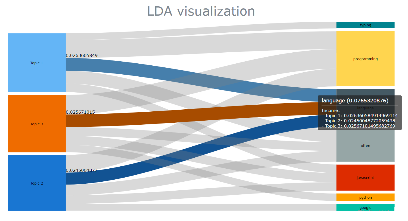
Foreword: this post is dedicated to my workmate and friend Martin, who recently showed me some pretty cool stuff he has been doing with sankey charts
Back in the early days of the 2020 pandemic, I got a bit bored at home and started thinking about creating a website. I remember that the first idea that I got was that I would write a couple of articles dedicated to topic modelling, and see where that would take me to. It had seemed like a logical decision, as the thesis that I had written for my MSc was entitled “Information extraction of short text snippets using Topic Modelling algorithms” (yeah, it was that boring). I had done quite a bit of work around that field, and this website that you just landed on was originally supposed to be much more centered on computational linguistics than it currently is.
Almost three years later, I must say that though natural language processing as a whole has had its fair share of novelties, the field of topic modelling doesn’t seem to have changed much. The three or four statistical models that were mainly used back then are still the most popular. Worse, unless you decide to use BERTopic to automatically detect how to split your topic clusters, you’re still going to have to manually input the n number of topics that you think a given corpus contains.
That being said, some libraries have certainly improved, and if I had to rethink some of the code that I wrote three years ago, I would now probably use Gensim instead of scikit-learn. But besides that, pretty much all of the underlying theory and approach would remain the same.
What has changed then? Well JavaScript, and to a lesser extent TypeScript, have gradually surpassed Python as my favourite languages. Over the past year or so, I have found myself doing more and more of my data processing work leveraging these two languages and the fantastic ecosystem that they offer.
As you might have guessed, the purpose of this article isn’t to bring anything new to the table, but rather to show how we can revisit the way that information extraction has pretty much always been represented. We’ll be doing so thanks to a great visualisation package named AnyChart that we have already discussed a few times on this website.
Topic modelling 101
At a high level, what we’re trying to do here is infer a number n of topics that are more or less hidden within a document or a set of documents.
If we were to describe Arthur Conan Doyle’s The Hound of the Baskervilles to a friend, we’d probably say that it tells the story of a series of crime that were committed by a terrifying demon-like dog. Or something along those lines. Anyway, we’d probably then add that the book’s main themes are the contrast between urban and rural life, the opposition between supernatural and rationalism, etc.. And for each of these themes, we’d pick a few words that we think provide a good representation of the themes that they support.
Now, how would we do that though? How would we find these hidden themes, and the terms that best support them? One of the most popular algorithms that we could use is called Latent Dirichlet Allocation, or more simply put, LDA.
At a high level, LDA models determine the word tokens contained within a document, before building topics from those tokens. We wouldn’t be too wrong if we compared LDA models to kMeans algorithms, as both require an arbitrary n number of topics or clusters. Where they differ though, is that LDA models accept the hypothesis that a single term can be represented across multiple topics.
If you want to know more on this topic (no pun intended), the following video does a great job at explaining how the probability for each term to appear within a topic is inferred:
JavaScript and topic modelling: a complicated relationship
I recently wrote a series of articles dedicated to Winknlp and Compromise.js, two amazing packages for natural language processing. Unfortunately, though both libraries certainly pack a lot of useful features, none of them seems to currently provide any topic modelling algorithm that we could play around with.
So let’s instead perform a quick search on npm for “topic modelling” and see what packages are returned:
-
LDA: Last updated 5 years ago, this package seems to work fine when installed within a Node environment, but I keep getting a bunch of errors when running it on the client side. I tried several content delivery networks, but haven’t really been able to find a workaround.
-
STDLib.js: this is the package that we’ll be using in this article. Stdlib offers a variety of features, such as an acronym expander. Unfortunately, as we’ll see later in this article most of its functionalities actually offer very little room for control and customisation.
I’m finding it quite surprising to see that JavaScript seems to be currently lacking good topic modelling solutions, especially when compared with some of the popular Python libraries such as the previoulsy mentioned Gensim or BERTopic.
Yeah, that’s a bit disappointing. But hey, I have some good news! The only thing that we’re trying to do here is come up with some fancy and unusual ways of visualising the relationship between a set of topics and their corresponding top terms. So we really won’t care about which model we are using, or how accurate our results are.
STDLib, here we come!
I would be lying if I said that I’ve been a long-time user of STDLib.js. I actually only first heard about this package a few months ago, but it really seems to offer some pretty useful functionalities:
expandAcronyms(): turns acronyms into their full formexpandContractions(): expands contractions to their full formordinalize(): this converts an integer to an ordinal string. Pretty coolporterStemmer(): I would have found a lemmatizer much more useful, but why nottokenize(): your typical tokenizer
And of course, last but not least:
lda(): an implementation of the LDA algorithm that we’re going to delve into in a couple of minutes
How the STDLib package works is pretty straightfoward. As we’ll be rendering our charts in the browser, we’re simply going to need an html page and a pair of <script></script> tags of type “module”:
<script type="module">

</script>
Of course, we’ll then need some data. The last thing we want is to make this exercise more complex than it should be. We’ll simply copy and paste some random paragraphs from Wikipedia. Say, the respective entries for Python, JavaScript, and Go should do:
const docs = [

  "Python is a high-level, general-purpose programming language. Its design philosophy emphasizes code readability with the use of significant indentation. Python is dynamically typed and garbage-collected. It supports multiple programming paradigms, including structured (particularly procedural), object-oriented and functional programming. It is often described as a 'batteries included' language due to its comprehensive standard library. Python was conceived in the late 1980s by Guido van Rossum at Centrum Wiskunde & Informatica (CWI) in the Netherlands as a successor to the ABC programming language, which was inspired by SETL, capable of exception handling and interfacing with the Amoeba operating system.",

  "JavaScript, often abbreviated as JS, is a programming language that is one of the core technologies of the World Wide Web, alongside HTML and CSS. As of 2022, 98% of websites use JavaScript on the client side for webpage behavior, often incorporating third-party libraries. All major web browsers have a dedicated JavaScript engine to execute the code on users' devices. JavaScript is a high-level, often just-in-time compiled language that conforms to the ECMAScript standard. It has dynamic typing, prototype-based object-orientation, and first-class functions. It is multi-paradigm, supporting event-driven, functional, and imperative programming styles. It has application programming interfaces (APIs) for working with text, dates, regular expressions, standard data structures, and the Document Object Model (DOM)",

  "Go is a statically typed, compiled high-level programming language designed at Google by Robert Griesemer, Rob Pike, and Ken Thompson. It is syntactically similar to C, but with memory safety, garbage collection, structural typing, and CSP-style concurrency. It is often referred to as Golang because of its former domain name, golang.org, but its proper name is Go. Go was designed at Google in 2007 to improve programming productivity in an era of multicore, networked machines and large codebases. The designers wanted to address criticism of other languages in use at Google, but keep their useful characteristics: Static typing and run-time efficiency, Readability and usability, High-performance networking and multiprocessing.",

];
After we import the lda package, all that we need to do is create an lda object and choose a number of topics. A quick look at the official documentation shows that, well, just these two parameters and we’re good to go:
import {lda} from "https://cdn.jsdelivr.net/gh/stdlib-js/nlp@esm/index.mjs"


let model = lda(

    docs,

    3

);
The next step is arguably a bit more interesting, as we can finally pass some arguments into the fit() method:
model.fit(

    5000,

    100,

    10

);
Where:
5000is the number of sampling iterations100is the number of estimates that are discarded at the beginning10is the number of estimates discarded between each iteration
And that’s pretty much it! We can now print the top 3 terms for the first topic:
const getTerms = (topic,words) => {

  let terms = model.getTerms(topic,words);

  for (let t in terms) {

    console.log(terms[t])

  }

}


getTerms(0,3);
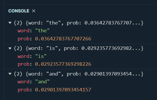
As you can see, we should have cleaned up our data first, by removing stopwords and punctuation signs. To do this, we’re going to use a very simple package named Stopword:
import stopword from "https://cdn.jsdelivr.net/npm/stopword@2.0.6/+esm"


const getCleanedText = (data) => {

  let result = new Array();

  let punctuation = "!\"#$%&'()*+,./:;<=>?@[\\]^_`{|}~";

  let regex = new RegExp("[" + punctuation + "]", "g");

  for (let d of data) {

    result.push(

      stopword

        .removeStopwords(d.split(" "))

        .join(" ")

        .replace(/(\b(\w{1,3})\b(\s|$))/g, "")

        .replace(regex, "")

        .toLowerCase()

    );

  }

  return result;

};


const docs_cleaned = getCleanedText(docs);
Here’s what we just did:
stopword.removeStopwords()takes an array of strings, which is why we’re splitting our sentences into tokens, and then joining these tokens back into a string- Unfortunately, the Stopword package doesn’t seem to be able to get rid of punctuation signs. To remove those, we’ll have to use some much-hated regular expressions
- Finally, our tokens must be turned to their lower case form, in order to avoid duplicate terms
Our cleaned documents should now look like this:

Quite logically, if we were to run our getTerms() function again we would now get some much better results. But while we’re here, why don’t we rewrite our code and try to capture all the topics and their top n terms:
const getTerms = (topic,words) => {

	for (let i of Array(topic).keys()) {

    	let terms = model.getTerms(i,words);

      	for (let t in terms) {

          let scores = Object.values(terms[t]);

          console.log(`Topic ${i+1} => Term: ${scores[0]} => Score: ${scores[1]}`);

        }

    }

}


getTerms(3,5);
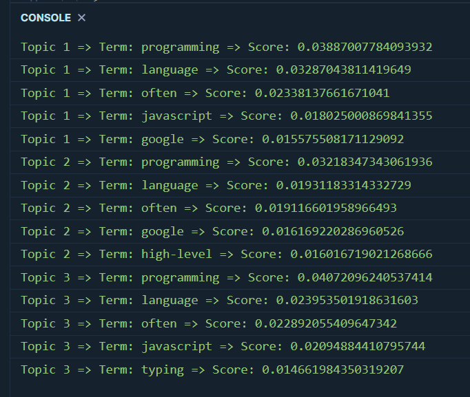
We’re getting there!
Say no to bar charts: Circle packing edition
As you probably know if you’re a regular follower of this website, AnyChart is a great visualization solution that provides easy to create and yet powerful representations for pretty much any type of data that one can think of.
Now if you open up your favourite search engine, type in “topic modelling analysis” and look for corresponding images, you’ll realise that topic clusters will generally be represented either as a series of bar charts, or as a scatter plot. Though AnyChart obviously supports both bar and scatter plots, it also provides the two following types of charts, that we’re going to be taking a closer look at today:
- Circle packing charts, also known as circular treemaps charts
- And Sankey charts, which are some sort of flow diagrams
Alright, so we know how to create a JavaScript object for each topic, and compute the top words as well as their score. But we need to find a way to represent these clusters. If we head over to AnyChart’s documentation page, we’ll see that our clusters and terms object needs to be in the following format:
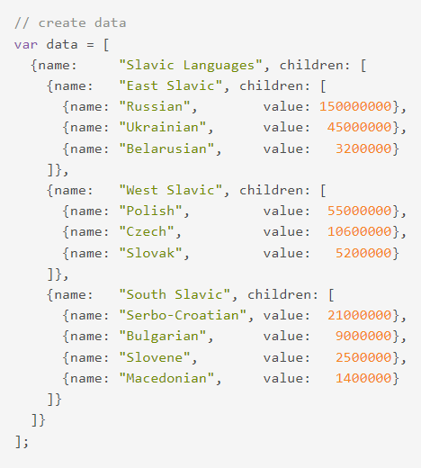
To get there, we’re going to have to make some small adjustments to our getTerms() function:
const getTerms = (n_topics, n_terms) => {

  let struct = new Array();

  for (let i of Array(n_topics).keys()) {

    let children = new Array();

    const terms = model.getTerms(i, n_terms);

    const term = Object.values(terms);

    term.forEach((t) => {

      children.push({ name: t["word"], value: t["prob"] });

    });

    struct.push({ name: `Topic ${i + 1}`, children: children });

  }

  const result = [{ name: " ", children: struct }];

  return result;

};


let t = getTerms(3,5);

console.log(t);
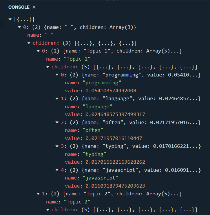
Let’s now take a step back and create a simple html page. We’ll start by importing the necessary packages:
<head>

    <script src="https://cdn.anychart.com/releases/8.11.0/js/anychart-core.min.js"></script>

     <script src="https://cdn.anychart.com/releases/8.11.0/js/anychart-circle-packing.min.js"></script>

     <link rel="stylesheet" href="lda_viz.css">

    </head>
In case you’re wondering what’s inside the css file that we just linked to, we’re just just setting some fixed width and height:
.container {

    display: flex;

  }

#viz {

    margin: 0px;

    width: 1100px;

    height: 600px;

  }
Of course, our first chart will be rendered within a pair of <div> tags. Nothing unusual so far:
<div class="container">

    <div id="viz"></div>

</div>
We’re now ready to call our freshly revamped getTerms() function and create a nice circle packing chart. Setting up a title and changing the font size are purely optional:
const getChart = (chart_title) => {

    const data = getTerms(3,5);

    let chart = anychart.circlePacking(data, "as-tree");

    chart.container("viz");

    chart.draw();

    let title = chart.title();

    title.text(chart_title);

    title.enabled(true);

    title.fontSize(35);

}


getChart("LDA visualisation");
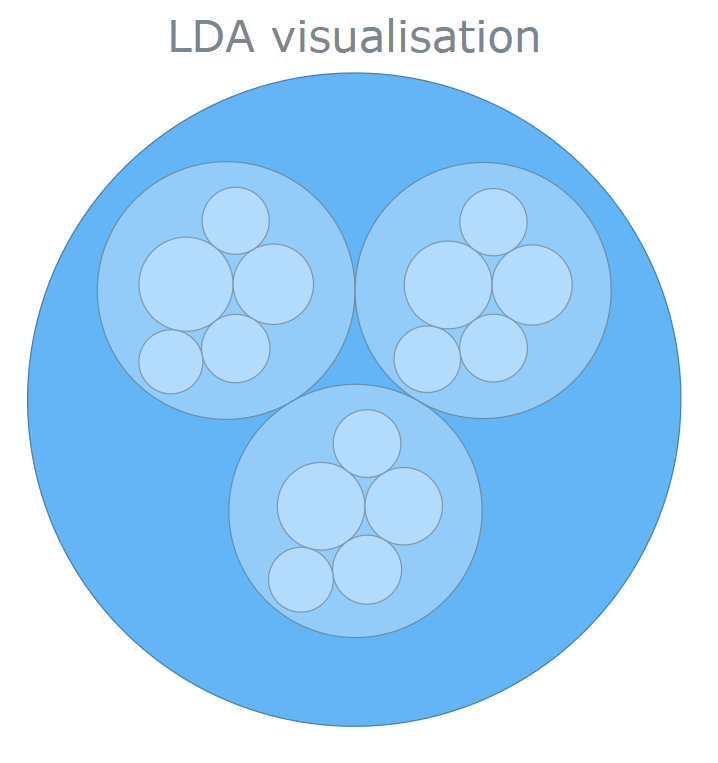
What I like about these circle packing charts, is that they’re fully interactive. When we move our mouse cursor over some of these circles, we get to see some useful information such as the topic name, its terms, and their score:
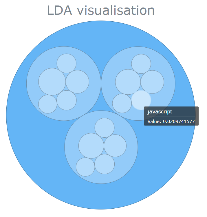
Not bad, but we can do even better!
Say no to bar charts: Sankey plots
Ok, that was pretty cool. But is there a way for us to also see if some terms that can be found within a particular topic, are also shared by one or some other topics? If yes, then how could we try to visualise these relationships?
As you have probably already guessed, one way we can do this is by creating a sankey chart!
Before we get there though, we’re going to have to slightly modify our getTerms() function again. According to AnyChart’s official documentation, our topics and terms relationship needs to be in yet another format. Long story shory short, we’re going to need a structure that resembles what can be seen in the following screenshot:
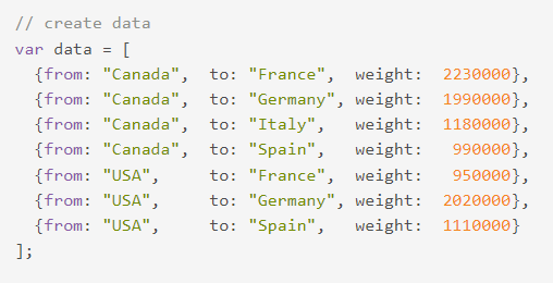
That should be pretty easy, and here’s how we can adapt our code so that it returns an array this time:
const getTerms = (n_topics, n_terms) => {

  let struct = new Array();

  for (let i of Array(n_topics).keys()) {

    let children = new Array();

    const terms = model.getTerms(i, n_terms);

    const term = Object.values(terms);

    for (let t in terms) {

      struct.push({

        from: `Topic ${i + 1}`,

        to: terms[t]["word"],

        weight: terms[t]["prob"],

      });

    }

  }

  return struct;

};


let t = getTerms(3,5);

console.log(t);
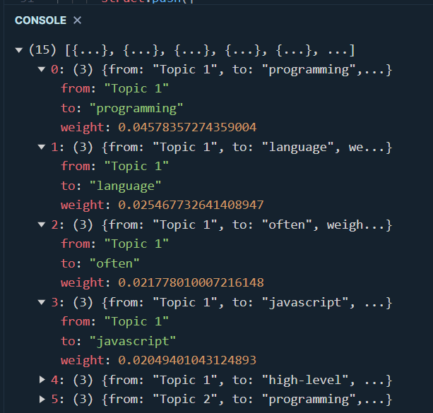
Our new getChart function isn’t too different from the one we wrote earlier on. Again, all the parameters that are set under the .draw() method are purely optional:
const getChart = (chart_title) => {

  const data = getTerms(3, 5);

  let chart = anychart.sankey(data);

  chart.nodeWidth("30%");

  chart.container("viz");

  chart.draw();

  let title = chart.title();

  title.text(chart_title);

  title.enabled(true);

  title.fontSize(35);

};


getChart("LDA visualization");
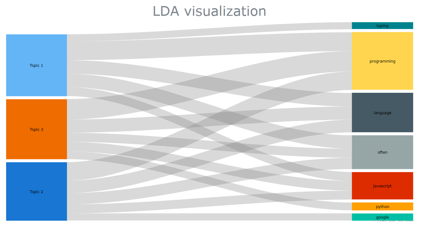
Not only does this look cool (doesn’t it?) and very easy to read, but each relationship between the topics (left) and the top terms (right) can be inspected, revealing some useful information:

There are a few more things that we could do at this point, like customize the colours of our edges and nodes, or add an intermediary flow to link between two nodes. That additional flow could represent part-of-speech tags, a sentiment score, etc..
But that’s already a lot for today, and all I can do now is invite you to check AnyChart’s gallery to see if you can find some great visualisation ideas for your next projects!