Minimalist CSS Frameworks for Your Data Science Projects
An example of what we’ll be doing in this article:
Disclaimer: I am absolutely not a web developer, which is actually why I wanted to write this article!
One of the biggest challenges for data practitioners isn’t to explore or process data, but to find effective ways to showcase their work. Of course, we can always build dashboards, share some Jupyter notebooks with our workmates, or paste a few charts and a couple of tables into a Microsoft Word document.
But how else can we show and promote our work? I personally believe that having a simple, but nice looking web application is an ideal way of presenting and sharing data driven projects across multiple stakeholders. Now, there is one major flaw in this approach: data analysts and scientists might not always have strong front-end development skills, or more simply the time to learn them.
So, is there an alternative way for us to create a website that looks fairly decent with just some basic knowledge of html? And most importantly without having to learn any css? In today’s article we’re going to focus on so-called minimalist css frameworks and they can help solve our problem.
Keeping things simple
To demonstrate how easy it is to generate some relatively good looking webpages, we’re going to create two html templates and see how we can improve them by using a few popular css frameworks.
“Template number 1” should be ideal for something like a natural language processing web application, or to ask a user to enter an array of numbers, process these values, and return a second array. Basically, any task that involves data transformation would be a good fit for our html file, which will contain:
- A header and paragraph elements
- Two stacked input “boxes”
- A drop-down selection box for us to choose between some options
- Two side-by-side buttons: one to “process” the user’s input, and one to clear it
Bear in mind that we’re going to deliberately keep things simple: no complex nested structure, no class or id attributes. So let’s try and see what this webpage looks like if we choose to rely on vanilla html only:
<!DOCTYPE html>

<html lang="en" dir="ltr">

  <head>

    <meta charset="utf-8">

    <title></title>

  </head>

  <body>

      <div>

        <h1>Data science website using <a href="" target="_blank">Vanilla html</a></h1>

        <p>A templated page for all our projects</p>

      </div>

      <form>

        <label>Enter your text here</label>

        <textarea rows="5" cols="80"></textarea>

        <label>Get your results here</label>

        <textarea rows="5" cols="80"></textarea>

        <select>

          <option>Option 1</option>

          <option>Option 2</option>

          <option>Option 3</option>

        </select>

        <button type="button">Process</button>

        <button type="button">Clear</button>

      </form>

  </body>

</html>

Not that great right?
Well we’ll get back to that later. For now, let’s move over to our second webpage! Since our daily job should involve working primarily with tabular data, “template number 2” will simply feature:
- A header
- Two pairs of collapsable
<detail>elements - A table
This is again going to be extremely simple, and here’s our slightly different code this time:
<!DOCTYPE html>

<html lang="en" dir="ltr">

  <head>

    <meta charset="utf-8">

    <title></title>

  </head>

  <body>

      <h1>Working with tabular data</h1>

      <details>

        <summary>Data table</summary>

        <table>

          <tr>

            <th>Rank</th>

            <th>Language</th>

            <th>Description</th>

            <th>Love percentage</th>

          </tr>

          <tr>

            <td>1</td>

            <td>Python</td>

            <td>A super popular language for data science</td>

            <td>90</td>

          </tr>

          <tr>

            <td>2</td>

            <td>JavaScript</td>

            <td>A great language for the web</td>

            <td>85</td>

          </tr>

          <tr>

            <td>3</td>

            <td>Perl</td>

            <td>My very first language!</td>

            <td>100</td>

          </tr>

        </table>

      </details>

  </body>

</html>
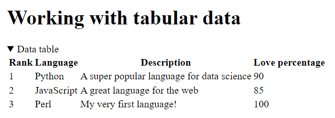
Well, that also looks pretty bad. Actually, I think it’s even worse than the first template!
CSS to the rescue
What we could do at this point is buy or borrow a couple of books, watch an online tutorial on YouTube, and learn the basics of css. And to be honest, that would be immensily valuable, as having some front-end development skills is definitely a big plus for data practitioners.
Or, we could rely on a minimalist css framework instead. Please note that these are, by nature, strongly opinionated. Because they perform a lot of actions in the background so that we don’t have to worry about the appearance of our webpage, they make decisions for us as to how most (if not all the) html elements that we write will end up looking like. The color of the components, the font type, the overall layout, will all be set up by a single file that will link to in our <head> tags. Now, we could always add an extra layer of css customization and change the appearance of some of the elements, but that would sort of defeat the purpose of using such frameworks.
Most specifically, here are the solutions that we will be reviewing today:
Just so that we’re clear: we could explore other options, such as Bootstrap or Pure But let’s keep in mind that these frameworks do require a bit more knowledge, as working with them involves defining some of the class attributes for the html elements that we want to implement.
Now personally, if I had to pick a solution that provides an ideal balance between ease of use and functionalities, one of my immediate choices would probably be Bulma. But let’s keep this for another article, as we’re now ready to explore our first minimalist css framework!
MVP.css
Of all the frameworks that we’re going to work with today, MVP.css is by far the most simple to use, but also the most limited. It’s a perfect alternative resource for programmers who might not be familiar with front-end development or might not want to spend time working on the aesthetics of their webpage. In my opinion, it is therefore the ideal candidate to illustrate the power of minimalist css frameworks and why you should use them.
But let’s now see how this all works!
It would be better practice to download the minified .css file and then link it in our document <head>, but grabbing it from a CDN works just as fine for what we’re trying to do today:
<head>

  <meta charset="utf-8">

  <link rel="stylesheet" href="https://unpkg.com/mvp.css@1.12/mvp.css">

</head>
The only change that we’re going to make, is to nest all our initial html code between a pair of <main></main> tags, as this will help MVP.css horizontally center the content of our webpage. Besides that, we won’t be adding any attribute to our html tags, just like we won’t have to specify a font or a colour either:
<body>

  <main>

    <h1>Data science website using <a href="" target="_blank">MVP.css</a></h1>

    <p>A templated page for all our projects</p>

    <form>

      <label>Enter your text here</label>

      <textarea rows="5" cols="80"></textarea>

      <label>Get your results here</label>

      <textarea rows="5" cols="80"></textarea>

      <select>

        <option>Option 1</option>

        <option>Option 2</option>

        <option>Option 3</option>

      </select>

      <button type="button">Process</button>

      <button type="button">Clear</button>

    </form>

  </main>

</body>
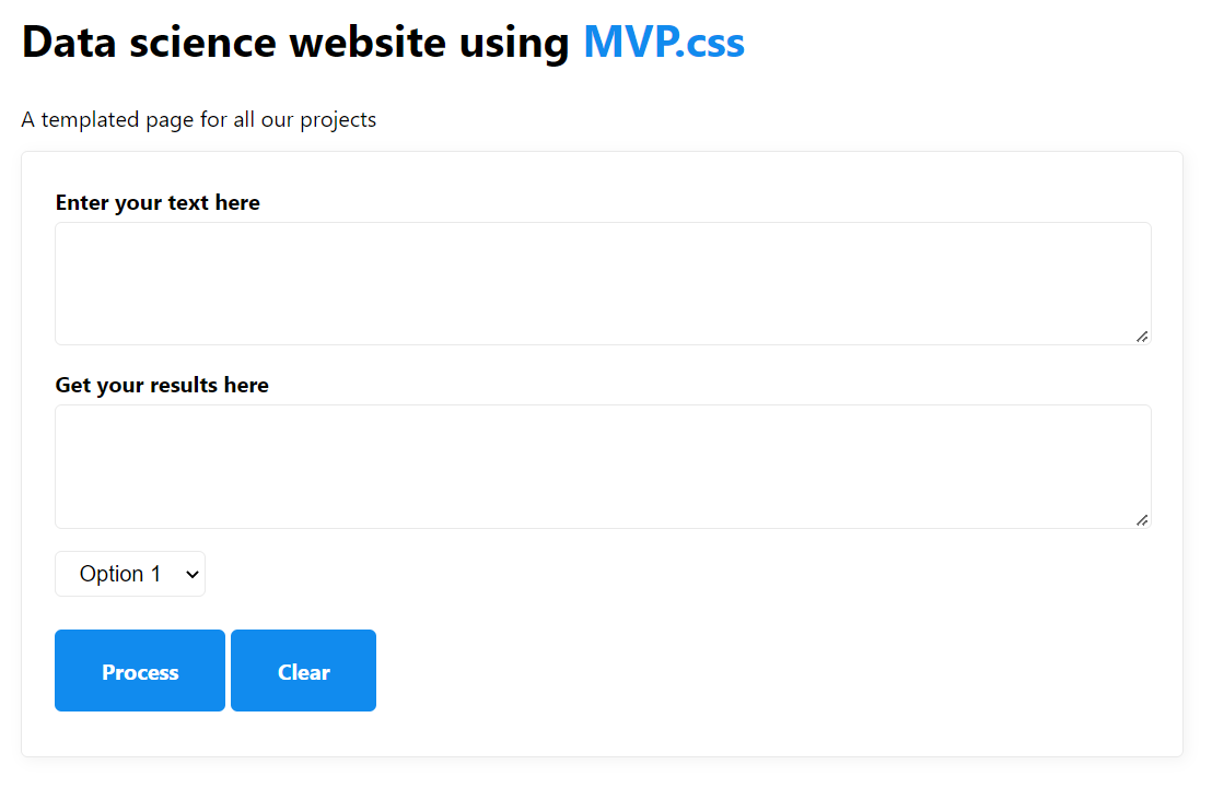
Remember our initial vanilla html “template 1” file? After linking to the MVP.css minified file and reloading our page, we should now see this entirely new webpage:

Though we’re probably not going to win any web development award for this, the result is arguably much better.
Meanwhile, the original “template 2” html file that we wrote earlier on has also drastically changed:
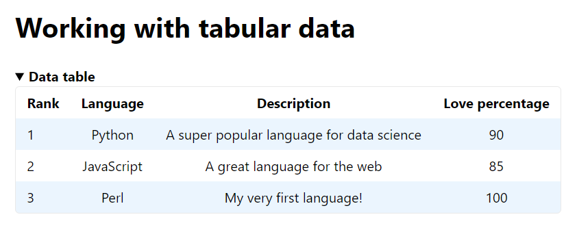
As you can see in the above screenshot, MVP.css has defined for us the size, color, and overall look and feel of the webpage. It has also picked a font, in this case Oxygen-Sans. Now if you head over to the official quickstart template, you will notice that the same settings apply to most of the common html elements that your average website will contain. We’re talking about nav bars, accordeons, input forms, etc..
And that, dear readers, is exactly what a minimalist css framework does.
Pico.css
In my opinion, Pico is the framework that offers the best balance between ease of use and creative freedom. Though less feature rich than for instance Spectre.css (see the Honourable mentions section below), Pico manages to pack a wide range of options, while remaining lightweight and easy to use.
Besides, though its base theme shows the usual white background / black font / blue buttons combination that should by now look somewhat familiar to us, it features a dark mode that feels very classy and sets it apart from its competitors.
Activating the built-in dark mode is pretty straightforward:
<html lang="en" dir="ltr" data-theme="dark">
We then need to link to Pico.css’s file, just like we did with MVP before:
<head>

  <meta charset="utf-8">

  <link rel="stylesheet" href="https://unpkg.com/@picocss/pico@latest/css/pico.min.css">

</head>
And we are now ready to paste the following html code between our <body></body> tags:
<main class="container">

  <div class="headings">

    <h1>Data science website using <a href="" target="_blank">Pico.css</a></h1>

    <p>A templated page for all our projects</p>

  </div>

  <form>

    <label>Enter your text here</label>

    <textarea rows="5" cols="80"></textarea>

    <label>Get your results here</label>

    <textarea rows="5" cols="80"></textarea>

    <select>

      <option>Option 1</option>

      <option>Option 2</option>

      <option>Option 3</option>

    </select>

    <a href="#" role="button">Process</a>

    <a href="#" role="button">Clear</a>

  </form>

</main>
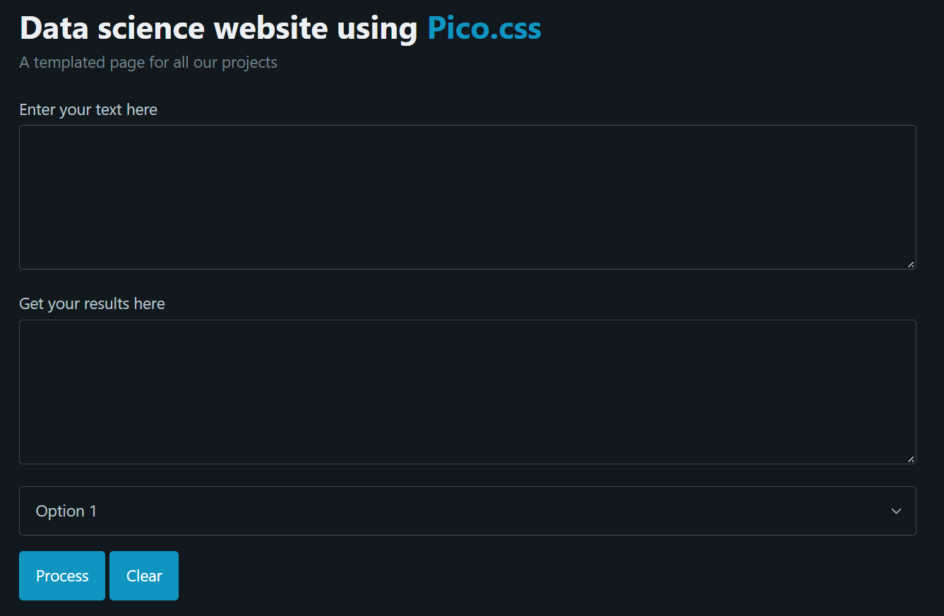
Pico.css’s tables also vastly improve upon the vanilla html way of rendering structured data:
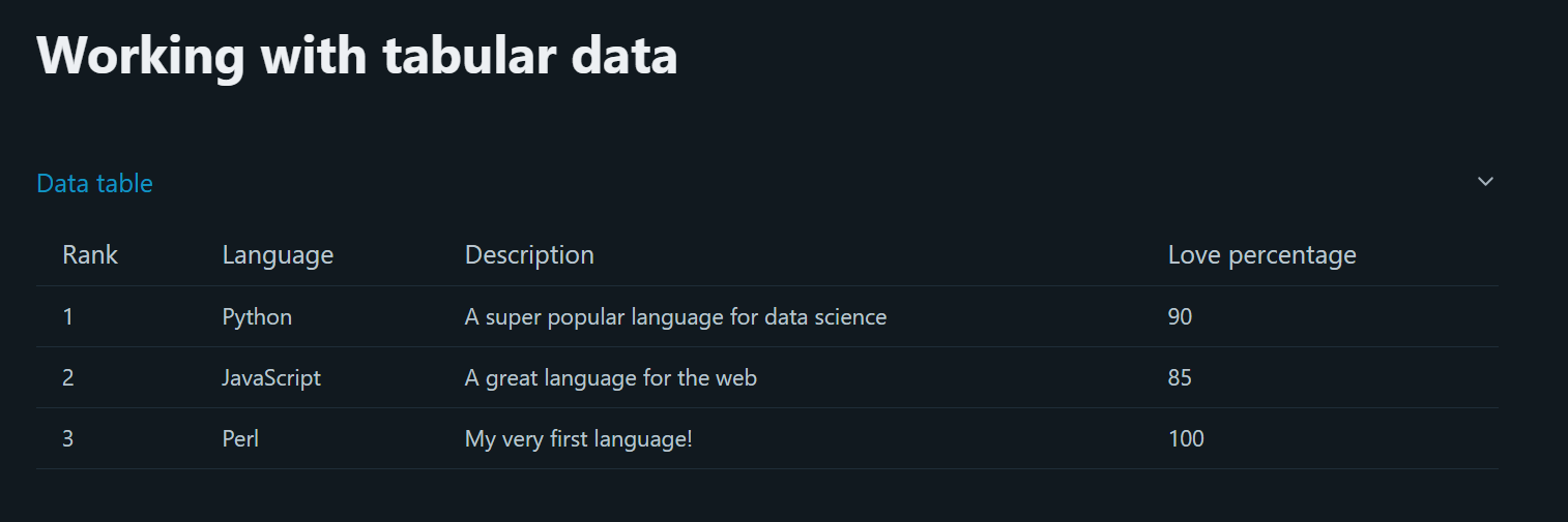
You might have already spotted the slight difference between the html code that we wrote for the MVP.css webpage, and this one: we added a class= attribute of "container" to our opening <main> tag. If you’re not familiar with css containers, don’t worry! Basically, what they do is provide some padding to both the left and right of our html elements, ensuring a coherent alignment for the content on our webpage. In this case, were we to remove the "container" class from our class= attribute, our webpage would be completely stuck to the left of the browser window.
Onto the next framework!
Milligram.css
Fundamentally, Milligram works exactly like all the other solutions that we’re reviewing in this article. It provides the same range of features, no more, no less. However, I personally quite like its aesthetics, and the light grey / purple combination is what makes Milligram.css stand out from the crowd.
We will this time need to link to three different css files, not just one:
<head>

  <meta charset="utf-8">

  <link rel="stylesheet" href="https://fonts.googleapis.com/css?family=Roboto:300,300italic,700,700italic">

  <link rel="stylesheet" href="https://cdnjs.cloudflare.com/ajax/libs/normalize/8.0.1/normalize.css">

  <link rel="stylesheet" href="https://cdnjs.cloudflare.com/ajax/libs/milligram/1.4.1/milligram.css">

</head>
Once again, we have to nest our html template between a pair of <main></main> tags and assign them a class attribute of "container:
<main>

  <div class="container">

    <h1>Data science website using <a href="" target="_blank">Milligram.css</a></h1>

    <p>A templated page for all our projects</p>

  </div>

  <div class="container">

    <form>

      <label>Enter your text here</label>

      <textarea rows="5"></textarea>

      <label>Get your results here</label>

      <textarea rows="5"></textarea>

      <select>

        <option>Option 1</option>

        <option>Option 2</option>

        <option>Option 3</option>

      </select>

      <button type="button">Process</button>

      <button type="button">Clear</button>

    </form>

  </div>

</main>
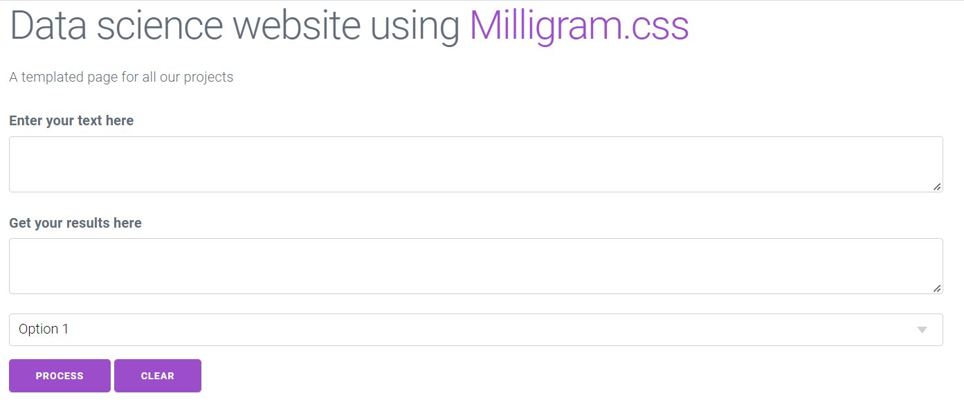
As just discussed, I really like the design choices that the creators of this framework have made. However, while Milligram.css’s table elements look quite nice, I personally find them something a bit dull and lacking in contrast:

LaTex.css
What is immediately likeable about LaTex.css, is its unique look and feel that will likely appeal to you if you have ever had to write a thesis or submit some papers for school. As you have probably already guessed, this frameworks takes its inspiration from the famous LaTex software system, and would therefore be an ideal solution for anybody who’s still in school or university and wants to create a simple website.
At this point, we all know what the next steps are, right?
<head>

  <meta charset="utf-8">

  <link rel="stylesheet" href="https://latex.now.sh/style.css">

</head>
And now one last time, onto our <body></body> tags:
<main class="container">

  <div>

    <h1>Data science website using <a href="" target="_blank">Latex.css</a></h1>

    <p>A templated page for all our projects</p>

  </div>

  <form>

    <label>Enter your text here</label>

    <textarea rows="5" cols="80"></textarea>

    <label>Get your results here</label>

    <textarea rows="5" cols="80"></textarea>

    <select>

      <option>Option 1</option>

      <option>Option 2</option>

      <option>Option 3</option>

    </select>

    <button type="button">Process</button>

    <button type="button">Clear</button>

  </form>

</main>
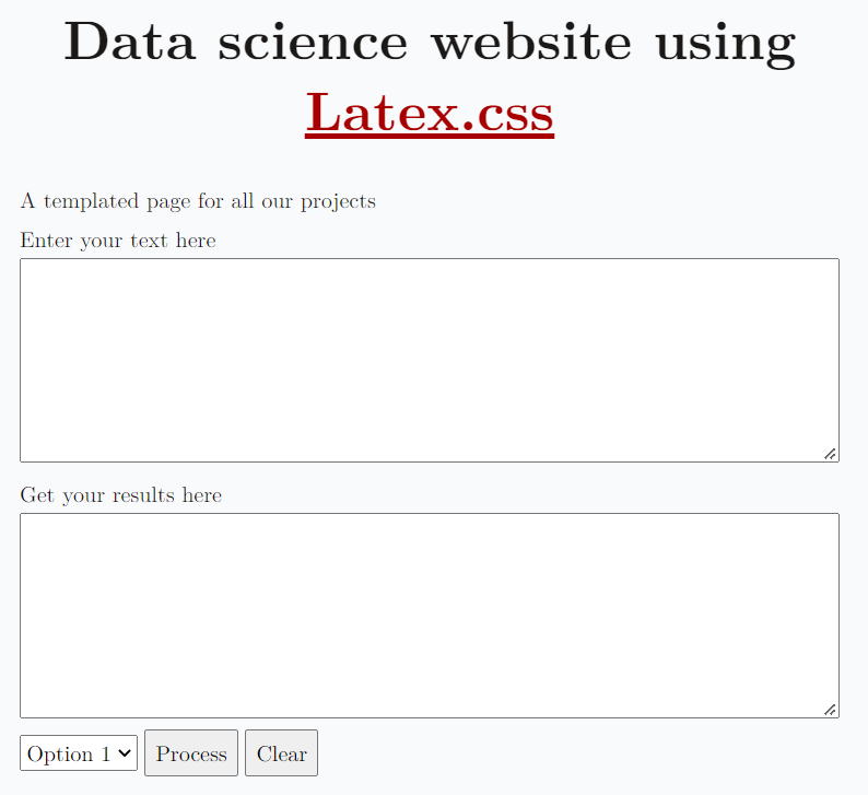
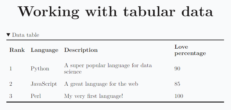
Our webpage looks simple and yet refined, and its table counterpart is equally as impressive:
Honourable mentions
The following frameworks are also pretty solid, and the only reason they didn’t get their own dedicated section is that I thought that this article was already long / repetitive enough.
Of those, I personally find Spectre.css to be the most interesting, as it allows its users to go quite deep in what they can do with each html element that this framework supports. It is however also slightly more complex to use than its competitors, as it introduces class attributes to allow for deeper level of personalization.
Bonus: Doodle.css
Though I would clearly recommend against using the following framework for business related purposes, I see Doodle.css as a great way to teach kids to code and show them how to build a simple webpage.
I won’t be sharing details about the html code this time as we should now know what steps to follow, but our webpage would look like this:
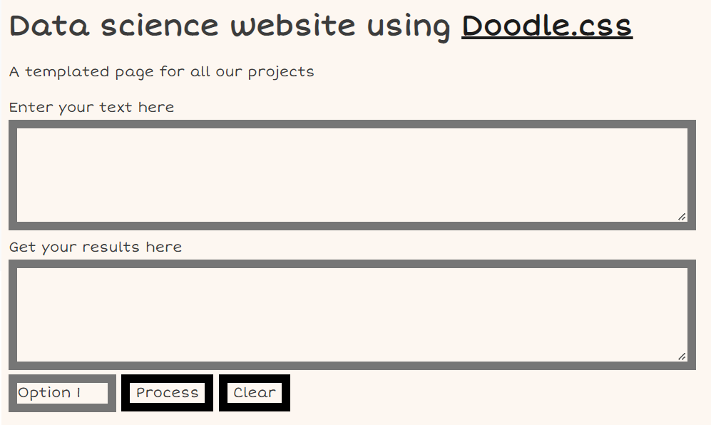
Pretty neat if you want my opinion, but not really suited for a professional project indeed!
Conclusion
With the recent rise in popularity of PyScript (read my article here), I personally see a lot of value in knowing how to quickly build a decent-looking website.
To be fair, what we just did throughout this article was very basic, but the potential of these minimalist css frameworks is pretty much unlimited. Getting familiar with at least one of these solutions is a pretty low hanging fruit, and who knows, you could end up falling in love with web development!