Network Graphs Part I: Python and JavaScript
An example of what we’ll be doing in this article
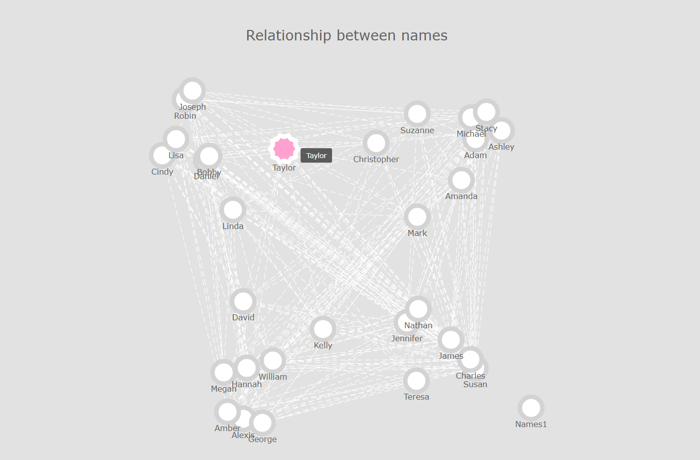
A quick note before we start. The purpose of today’s article isn’t to show how network graphs work and discuss their underlying mathematical structure. Instead we’re going to focus on practical applications and easy to reproduce examples, using two of the most popular programming languages of the early 2020s: Python and JavaScript.
Typically, a network graph will allow us to visualise the various entities that live within a complex network structure, and see how densily its nodes are connected. In theory (as in, not always) this will greatly facilitate identifying clusters, detecting outliers, etc.. As you probably know, some of the common use cases for this type of chart include the mapping of followers across multiple social media accounts, the identification of large-scale fraudulent behaviour, etc..
If you’re not too familiar with nodes and edges, I highly suggest reading this very good article, which provides some detailed explanations around the basic concepts of graph theory.
Additionally, if like me you tend to learn more from watching videos, I would then recommend this one:
Objective
What we’re trying to achieve today is actually pretty straightforward:
Given a multiple-column .csv file, can we write some reusable code in both Python and JavaScript that allows us to visualise the relationships between the values contained within these columns? As we will see throughout this article, using either of these two language comes with its pros and cons.
We’ll be using the following two datasets, that can both be found on my GitHub page:
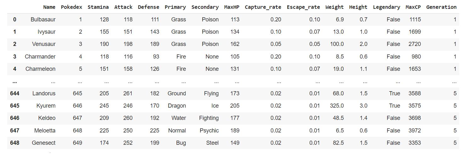
- pokemon_go.csv. This is, as its name suggests, a copy of the Pokemon Go dataset that can be found on Kaggle. The main columns we’ll be using are the “Primary” and “Secondary” attributes for all Pokemons within the Pokémon GO mobile game.
Below are the first 5 rows for this dataset:
- fake_names.csv: A larger, 600 row long dataset that I created using the Faker library. Generating this type of data is actually quite easy, as shown below:
import pandas as pd

import random

from faker import Faker


def getFakeData(howmany):

    fake = Faker()

    group = [i for i in range(1,5)]

    names = [fake.unique.first_name() for i in range(60)]

    data_dict = {

        "Names1": [random.choice(names) for i in range(howmany)],

        "Names2": [random.choice(names) for i in range(howmany)],

        "Group": [random.choice(group) for i in range(howmany)]

     }

    result = pd.DataFrame(data_dict)

    return result


df = getFakeData(600)

df.to_csv("fake_names.csv")
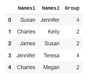
Running the above code will save the following Dataframe object as a csv file onto your local machine:
Part 1: NetworkX (Python)
Before we start, I guess I should mention that I initially considered including graph-tool to this article. However, this library hasn’t been updated since 2015, and to be quite franck, I have only had very limited exposure to it. That’s why we’ll be focusing mainly on NetworkX, which is probably the most popular network graph library for Python at the moment. Here’s how its authors like to introduce it:
“NetworkX is a Python package for the creation, manipulation, and study of the structure, dynamics, and functions of complex networks.”
Let’s start by making sure that we have the necessary libraries. If you’re wondering why we might want to import PyPlot, that’s because NetworkX’s .draw() method actually uses Matplotlib as its plotting back-end engine. Please note that this step is completely optional, but importing PyPlot will help with resizing our charts and modifying their appearance.
import pandas as pd

import networkx as nx

from matplotlib import pyplot as plt
By the way, from now on we’ll be referring to the two aforementioned datasets as follows:
df_pk_go = "https://raw.githubusercontent.com/julien-blanchard/dbs/main/pokemon_go.csv"

df_fake_n = "https://raw.githubusercontent.com/julien-blanchard/dbs/main/fake_names.csv"
NetworkX’s website has a fairly good “get started” guide that you can read through if you want to learn about the basics of graph visualisation in Python. But to make things quicker, we’re going skip the first steps of the official tutorial and jump straight into creating our first nodes and edges:
G = nx.from_pandas_edgelist(df_pk_go, "Primary", "Secondary")

edgelist = nx.to_edgelist(G)

print(edgelist)
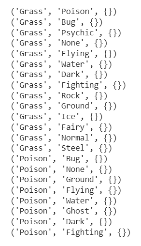
Here, we passed the DataFrame object and its two main series into NetworkX’s from_pandas_edgelist(), and then created a simple list of edges using the to_edgelist() method.
But let’s see what happens now if we add a new parameter, edge_attr=True, to our code above:
G = nx.from_pandas_edgelist(df_pk_go, "Primary", "Secondary", edge_attr=True)

edgelist = nx.to_edgelist(G)

for edge in edgelist:

    print(f"{edge[0]},{edge[1]}\n\t{edge[2]}")
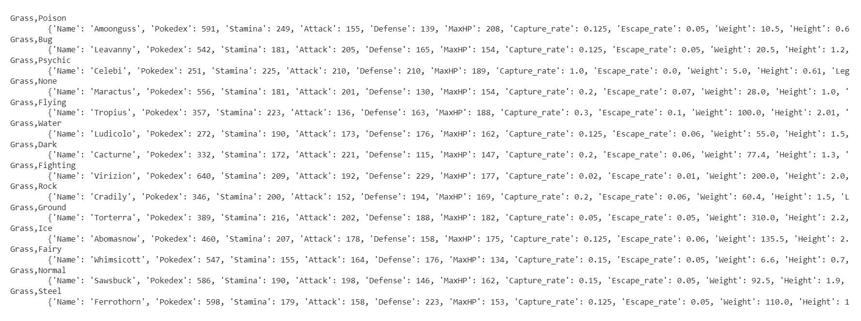
As you can see, all the other series that contain numeric values have been added to our data structure as edge attributes. This extra information will come in handy when we try to apply a color scale, or create different sizes for the nodes in our network graph. Please note that besides boolean values, edge_attr= also accepts the name of a serie, or a list of series.
That being said, for our first attempt we’re going to keep things simple and generate a network plot that graphs the basic relationship between the “Primary” and “Secondary” series. We can use Pandas’s .filter() method to reduce our DataFrame object and assign it to variable named n:
n = df_pk_go.filter(["Primary", "Secondary"])

n = n[n["Secondary"] != "None"]
Remember when we discussed using Matplotlib a few paragraphs above? Well, we’re going to need a figure object:
def getNetwPlot(data,serie1,serie2,title):

  G = nx.from_pandas_edgelist(data, serie1, serie2)

  edgelist = nx.to_edgelist(G)


  plt.figure(figsize=(12,8))

  nx.draw(

      G,

      with_labels = True,

      font_size = 15,

  )

  plt.title(title)

  plt.show()


getNetwPlot(n,"Primary","Secondary","Types relationship in the Pokemon GO dataset")
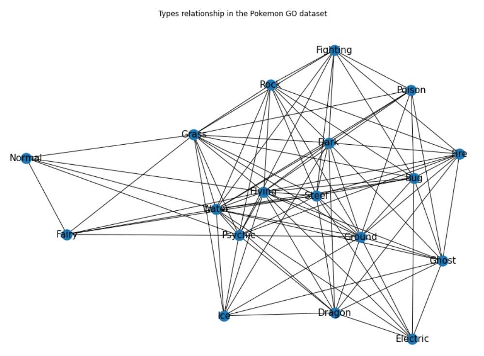
Right, so this is arguably a pretty basic network graph, but it still offers a fairly interesting overview of the relationship between the “Primary” and “Secondary” series.
What’s missing in this graph though, is a way to reflect all these adjacent values that we saw earlier on when printing the second iteration of our list of edges. Our next step now, is to see how we can best leverage the edge_attr=True argument that we experimented with earlier on to add a color-based dimension and varying sizes to our nodes.
Still using the same approach as before, we’re going to add a few more series to our reduced n DataFrame object:
n = df_pk_go.filter(["Primary", "Secondary", "Attack", "Defense", "Capture_rate"])

n = n[n["Secondary"] != "None"]
A simple but arguably “dumb” way to add a colorscale to our nodes, is to create a list of integers ranged between zero and the total number of nodes, and divide each of these integers by the total volume of nodes. What I mean by “dumb”, is that ultimately, this will in no shape or form serve as an indicator of potential clusters within our DataFrame object. Now the real issue here is that we haven’t defined any group or cluster! As a consequence, adding a colorscale to our node this way will only work from a purely “aesthetical” perspective:
colors = [i/len(G.nodes) for i in range(len(G.nodes))]

node_color=colors,

cmap="BuPu"
Though what we’re about to do next is absolutely optional, resizing the nodes based on their degree is relatively simple. NetworkX has a built-in method called .degree() that represents the number of edges adjacent to each node. We can easily access these weighted node degrees, aka the sum of the edge weights for edges incident to that node:
G = nx.from_pandas_edgelist(df_pk_go, "Primary", "Secondary", edge_attr=True)

for i in G.degree():

    print(i)
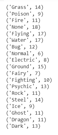
So logically, what we can do now, is try to artificially increase or decrease the size of the nodes, hoping that this will result in an increased readability of the chart.
node_size = [v * 200 for v in dict(G.degree()).values()]
Remember earlier when we realised that we hadn’t defined any group or cluster? Well I have some good news for you: we can still leverage the edge attributes that we introduced using the edge_attr=True parameter, and use these values to add varying sizes to our nodes. To do so, we’re again going to create a list comprehension, this time manually adjusting the values contained within our edgelist variable:
edge_size = [e[2]["serie_name"] / 500 for e in edgelist]
Let’s now put together everything that we have just learnt, and try our new and improved getNetwPlot() function:
def getNetwPlot(data,serie1,serie2,serie3,title):

  G = nx.from_pandas_edgelist(data, serie1, serie2, edge_attr=True)

  edgelist = nx.to_edgelist(G)


  colors = [i/len(G.nodes) for i in range(len(G.nodes))]


  plt.figure(figsize=(12,8))

  nx.draw(

      G,

      with_labels = True,

      node_size = [v * 200 for v in dict(G.degree()).values()]

      width_size = [e[2][serie3] / 500 for e in edgelist],

      font_size = 15,

      node_color = colors,

      cmap = "BuPu"

  )

  plt.title(title)

  plt.show()


getNetwPlot(n, "Primary", "Secondary", "Attack","Types relationship in the Pokemon GO dataset")
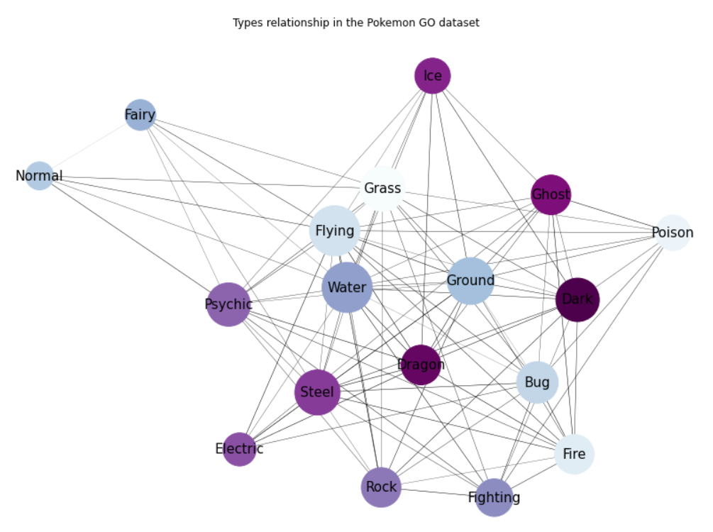
Alright, this is arguably much better! Let’s now see what happens if we call the exact same function, using this time our second dataset, and simply changing the colormap to pastel1:
def getNetwPlot(data,serie1,serie2,serie3,title):

  G = nx.from_pandas_edgelist(data, serie1, serie2, edge_attr=True)

  edgelist = nx.to_edgelist(G)


  colors = [i/len(G.nodes) for i in range(len(G.nodes))]


  plt.figure(figsize=(12,8))

  nx.draw(

      G,

      with_labels = True,

      node_size = [v * 200 for v in dict(G.degree()).values()]

      width_size = [e[2][serie3] / 500 for e in edgelist],

      font_size = 12,

      node_color = colors,

      cmap = "Pastel1"

  )

  plt.title(title)

  plt.show()


getNetwPlot(n, "Names1", "Names2", "Group","Names relationship for the fake names dataset")
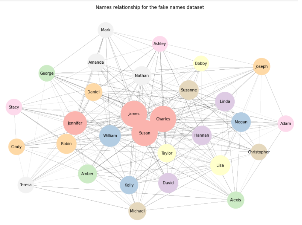
Again, that’s not too bad. If we want to focus on outliers rather than on clusters, we can always change the .draw() method to .draw_spectral():
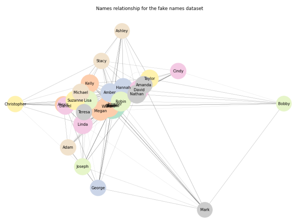
But we still have one major issue: the more nodes and edges we have, the less readable our network graph becomes. Wouldn’t it be great if we could just hover over each node, and immediately obtain some information about this exact node, and its immediate relationships?
To do so, we could use the Bokeh library as our plotting engine instead of Matplotlib. If this something that you’d like to invest some tine in, I would then highly recommend reading this very good article.
But guess what, we’re going to take a completely different approach!
Part 2: Anychart (Javascript)
Anychart is probably my favorite visualisation package for the JavaScript ecosystem. You can easily recreate all your favourite charts in just a few lines of code, or explore some more exotic rendering types like Calendar and Gantt charts for project management, Quadrant plots, Word clouds, etc..
On the plus side, it natively supports csv files through a module named Data Adapter, which comes with its nice built-in loadCsvFile() method. Now to be fair, a csv file loader isn’t that common a thing for JavaScript data visualisation libraries, which are usually designed to work primarily with JSON data. For anybody who has ever tried to build a Tableau-inspired dashboard in JavaScript, the trick is to try and rely on third-party packages such as D3.js or PapaParse.
As I’m probably going to write more articles on how to use some popular JavaScript visualisation packages, we might as well learn how to open and parse a csv file using the aforementioned D3.js .csv() method:
d3.csv(data).then(csv_file => {

  for (let c of csv_file) {

    console.log(Object.values(c))

  }

})
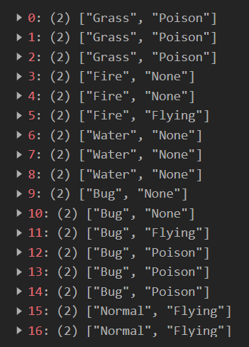
We now know how to loop through our csv file and access the comma-delimited columns using Object.values() (As you might have already guessed, had we used Object.keys() instead, we would have obtained the index position for each row). If you’re coming from Python or R and you are wondering what .then() does, you might want to read about concurrency, promises, and the async / await keywords.
It’s now time to head over to the documentation page, and see what specific data format we are expected to feed into our AnyChart network graph:
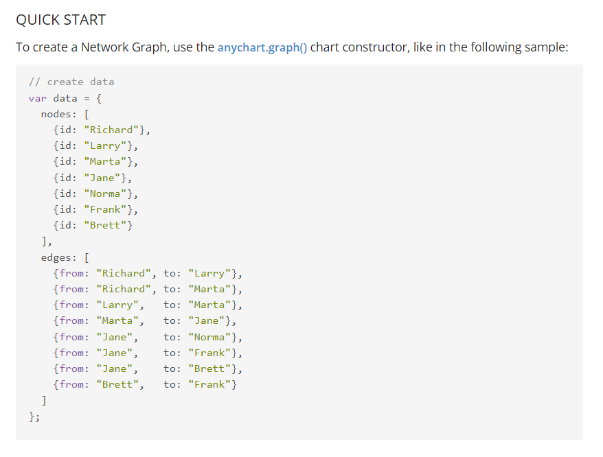
Rrrright, well, as you can see in the screenshot above, we’re going to have to write a function that transforms our simple comma-separated csv files into a slightly more complex data structure.
As a first step let’s create three empty arrays, where:
temp_nwill store all the values for our first column, including duplicatesnwill store all the unique values for our first columnewill store all the values for our second column, including duplicates
let temp_n = new Array();

let n = new Array();

let e = new Array();
We can now loop through each row of the csv file, and create the complex structure that we saw just a minute ago on AnyChart’s website:
for (let i in data) {

    temp_n.push( Object.values(data[i])[0] );

    e.push( {from: Object.values(data[i])[0], to: Object.values(data[i])[1]} );};

    temp_n = temp_n.filter((v, i, a) => a.indexOf(v) === i);


for (t of temp_n) {

    n.push( {id: t} );

};
If you’re wondering what .filter((v, i, a) => a.indexOf(v) === i) does, it simply removes all duplicate values from the temp_n array.
We’re almost there, as our network data structure is ready and matches the “official” one that we saw earlier!
let network = {nodes: n, edges: e};
Of course, our network chart will be displayed in an html page, where we will also link to the necessary packages, as well as to a css file that we’ll be discussing in a minute. So let’s paste the following lines of code into an empty .html file:
<head>

    <meta charset="utf-8">

    <link rel="stylesheet" href="network.css">

    <script src="https://d3js.org/d3.v7.min.js"></script>

    <script src="https://cdn.anychart.com/releases/8.11.0/js/anychart-core.min.js"></script>

    <script src="https://cdn.anychart.com/releases/8.11.0/js/anychart-graph.min.js"></script>

    <title></title>

</head>
Our network chart will be displayed inside a <div> element, still within the html file but this time between the main <body></body> tags:
<body>

    <div class="container">

      <div id="vis"></div>

    </div>

</body>
The network.css file will simply ensure that our network chart isn’t too small (it would have been by default):
.container {

  display: flex;

}

html, body, #vis {

  margin: 0px;

  width: 1000px;

  height: 800px;

}
We can now place the JavaScript code we wrote earlier on between a pair of <script></script> tags, add the following two lines of code, and finally double click on our html file!
<script type="text/javascript">


let chart = anychart.graph(network);

chart.container("vis");chart.draw();

</script>
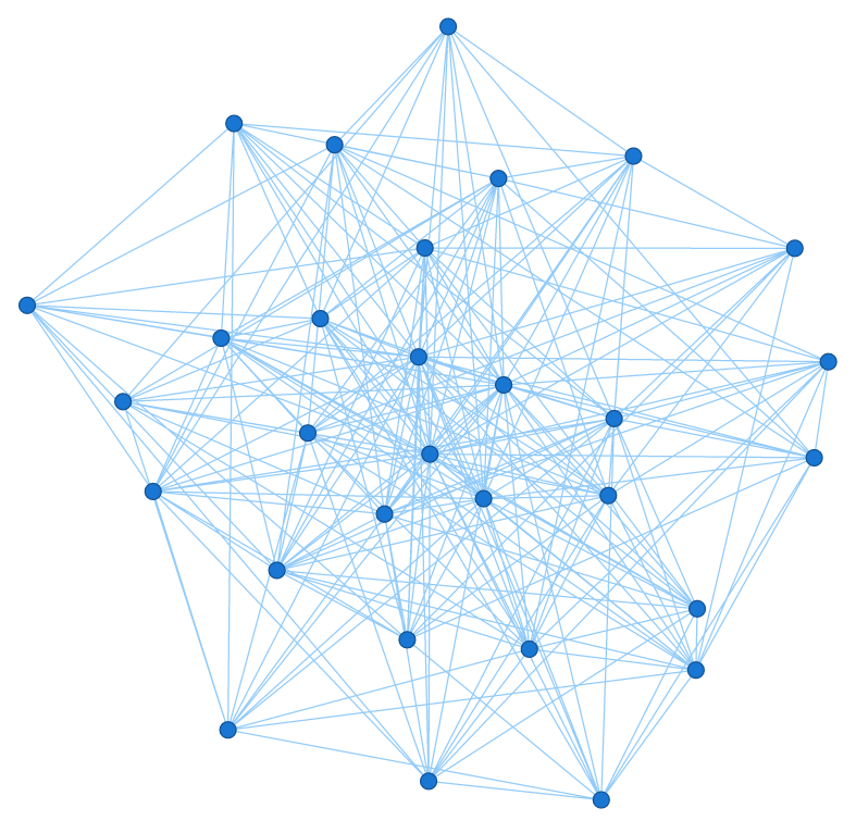
If everything went well, we should now see the rather minimalistic network graph above. What’s left to do is work on the aesthetics of the chart. Let’s start by adding a title to it:
let title = chart.title();

title.text(chart_title);

title.enabled(true);

title.fontSize(25);

title.fontColor("#616161")

title.fontFamily("verdana");
We should also change the background colour:
chart.background().fill("#e2e2e2");
What I really like with AnyChart, is that we can fully customise the appearance of the nodes and edges, including when they’re hovered on:
chart.nodes().labels().enabled(true);

chart.nodes().labels().fontSize(14);

chart.nodes().labels().fontColor("#616161");

chart.nodes().normal().height(40);

chart.nodes().normal().stroke("#d3d3d3", 8);

chart.nodes().normal().fill("#ffff");

chart.nodes().hovered().height(50);

chart.nodes().hovered().shape("star10");

chart.nodes().hovered().fill("#FFA1CF");

chart.nodes().hovered().stroke("#ffff", 8);

chart.nodes().tooltip().useHtml(true);
Now for the edges:
chart.edges().tooltip().useHtml(true);

chart.edges().normal().stroke("#ffff", 1, "10 5");
.. and we can finally refresh the .html file:
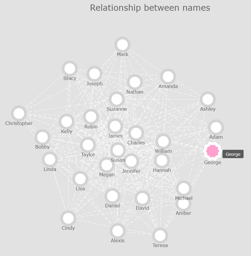
Now that’s already a lot better! However, we stil can’t really see any clusters or outliers in our data. So what we could do, is play around with AnyChart’s .iterationCount() method until we find a value that highlights the relationships and inter-dependencies between our nodes.
If we use a value of 0, we get the following result:
chart.layout().iterationCount(0);
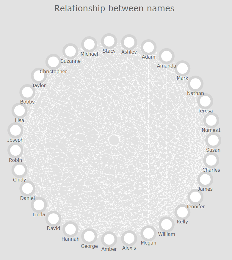
After a few attempts, I eventually found out that an integer value of approximately 45 would do the job:
chart.layout().iterationCount(47);

chart.rotation(40);

That’s much better, isn’t it? Let’s recap what we just did:
const getNetworkPlot = (data,chart_title) => {

    d3.csv(data).then(data => {


        // container arrays

        let temp_n = new Array();

        let n = new Array();

        let e = new Array();


        // looping through the CSV file

        for (let i in data) {

           temp_n.push( Object.values(data[i])[0] );

           e.push( {from: Object.values(data[i])[0], to: Object.values(data[i])[1]} );

           };

         temp_n = temp_n.filter((v, i, a) => a.indexOf(v) === i);

         for (t of temp_n) {

            n.push( {id: t} );

            };


         // data structure that can be read by AnyChart

         let network = {nodes: n, edges: e};


         // creating the chart

         let chart = anychart.graph(network);

         chart.layout().iterationCount(47);

         chart.rotation(40);


         // aesthetics


         // title

         let title = chart.title();

         title.text(chart_title);

         title.enabled(true);

         title.fontSize(25);

         title.fontColor("#616161")

         title.fontFamily("verdana");


         // background colours

         chart.background().fill("#e2e2e2");


         // nodes

         chart.nodes().labels().enabled(true);

         chart.nodes().labels().fontSize(14);

         chart.nodes().labels().fontColor("#616161");

         chart.nodes().normal().height(40);

         chart.nodes().normal().stroke("#d3d3d3", 8);

         chart.nodes().normal().fill("#ffff");

         chart.nodes().hovered().height(50);

         chart.nodes().hovered().shape("star10");

         chart.nodes().hovered().fill("#FFA1CF");

         chart.nodes().hovered().stroke("#ffff", 8);

         chart.nodes().tooltip().useHtml(true);


         // edges

         chart.edges().tooltip().useHtml(true);

         chart.edges().normal().stroke("#ffff", 1, "10 5");


         // ploting

         chart.container("vis");

         chart.draw();

         }

      );

  }


getNetworkPlot(pokemons,"Test");
Final thoughts
To be fair, network graphs aren’t the default type of visualisation that you will want to systematically use when exploring a dataset, but they can prove useful in some cases.
Besides, we had to write quite a bit of code to obtain a result that, as discussed just above, might not add much value as compared to more convential visualisation types, such as heatmap charts, or three-dimensional scatter plots.
One alternative to writing the code ourselves, is to use a third-party tool such as Gephi or Graphistry. But these are options that we will explore in a future article!