Choosing a Model for Time Series Regression With PyCaret
I have always found working with times series extremely interesting. I especially like the fact that it often starts with a single succession of data points, aka a “line”, and that understanding the dynamics behind this “line” usually involves creating adaptations of that initial set of values, like calculating a moving average or looking for indicators of seasonality for instance.
PyCaret is a low code machine learning framework for the Python programming language. It provides a variety of easy-to-use tools and features that lower the technical entry bar for processes such as model training and explainability, data preprocessing, EDA, etc..
I discovered this library quite recently while looking for tools that would simplify the process of finding the right Topic modelling algorithm for a given corpus, and found PyCaret’s dedicated natural language processing documentation to be particularly helpful.
As I’ve already written a couple of articles on Topic modelling, I thought that in today’s article we might as well cover another field of machine learning that PyCaret provides a lot of value to, namely time series forecasting.
D&D: dependencies and data
Before we start, there are quite a few libraries that have to imported if we want PyCaret to function properly. More specifically, we need to load Jinja2 and MarkupSafe into memory so that PyCaret’s setup() method can output an interactive process template (we’ll get to that later).
import pandas as pd

import matplotlib.style as style, matplotlib.pyplot as plt

from statsmodels.tsa.seasonal import seasonal_decompose

import jinja2

from markupsafe import escape

from markupsafe import Markup

from markupsafe import soft_unicode

from pycaret.regression import *

from sklearn.model_selection import train_test_split
The dataset that we will be using today is a .csv file that contains META’s stock price values between August 2021 and August 2022. Updated data can be downloaded directly from the Yahoo! Finance website.
Right now the dataset contains some columns that we won’t be needing, such as ["Open"], and there’s also a bit of preprocessing that we might want to do before we start investigating the close price values. The best way to do so is to use a technique called method chaining:
def getDataframe(url_address):

    df = pd.read_csv(url_address)

    return df


def getCleanedData(data):

    dframe = (

        data

        .set_index(pd.DatetimeIndex(pd.to_datetime(df["Date"]).dt.date.values))

        .filter(["Adj Close"])

        .rename(columns={"Adj Close": "Close"})

        .pipe(lambda x: x.assign(

            Variation = x["Close"].shift(1) - x["Close"],

            Rolling_mean = x["Close"].rolling(window=30).mean(),

            Rolling_std = x["Close"].rolling(window=30).std()

            )

        )

        .dropna()

        )

    return dframe


df = getDataframe("META.csv")

df = getCleanedData(df)

df.tail()
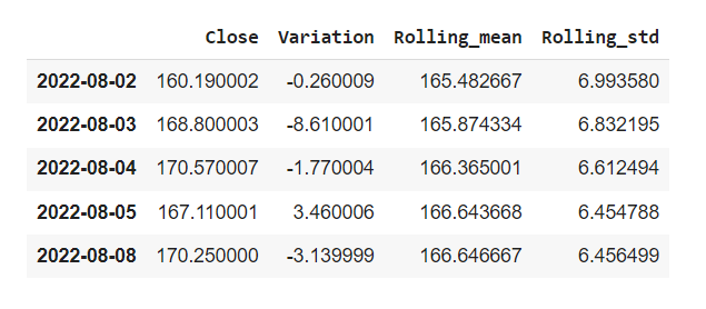
Let’s review what we just did:
- We set the values contained within the
["Date"]series as the index of our dataframe using the.set_index()method and passing the values of the["Date"]serie to avoid multilevel issues. - We’re only keeping one serie:
["Adj Close"]. - Why not rename this serie to
["Close"]? - Combining the
.pipe()and.assign()methods we’re creating three new series:["Variation"]which subtracts the n value for any given day by its preceding n-1 value. Then a["Rolling_mean"]serie which calculates a moving average over a 30 day time window, and its["Rolling_std"]counterpart for the moving standard deviation.
Basic data exploration
Before we create our first charts, we might want to set up a high-level style and use the official Matplotlib styles list for that purpose. This is absolutely optional, but it will help with standardising the global aesthetics of our visualisation assets. We can do this very simply with one line of code:
style.use("ggplot")
There are two reasons why we passed the ["Date"] serie as the index of our dataframe. Further down this article, it’s going to allow us to easily perform some time frequency resampling using the StatsModels library, but it’s also useful when using Pandas’s .plot() method as it automatically passes a dataframe’s index as the x-axis and all the series within the same dataframe as distinct y-axis lines.
def getLinePlot(data,title):

    data.plot(

        figsize=(13,9),

        title=title

        );


getLinePlot(df,"META stocks")
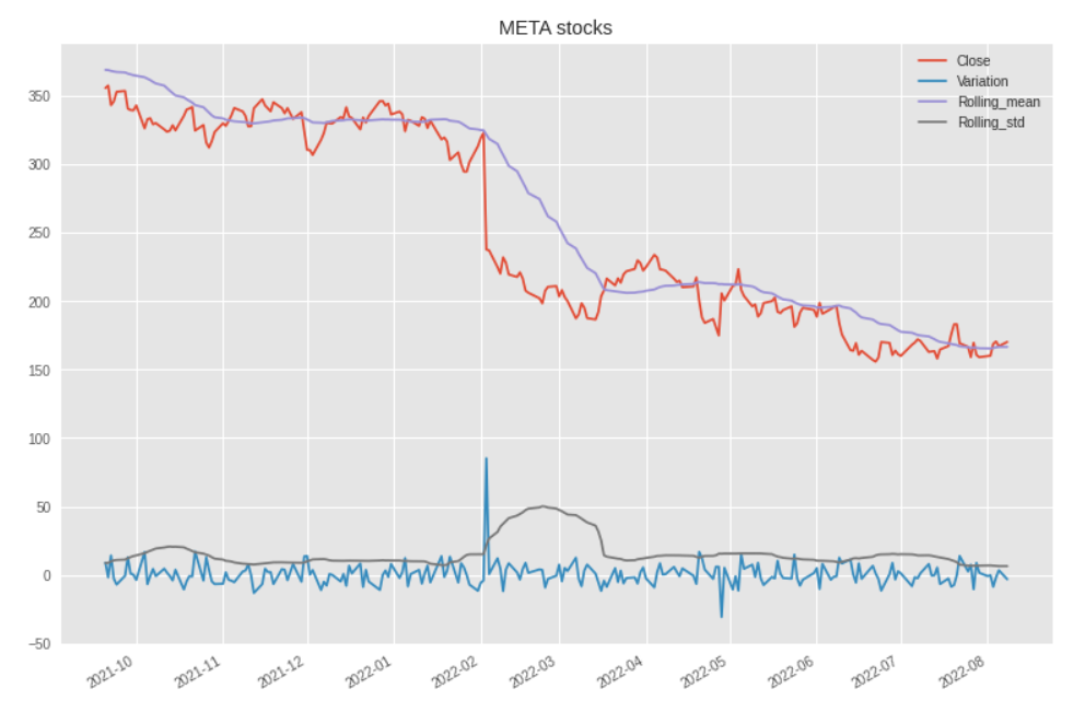
This is interesting. We can see that despite a general downward trend, there were only two major day-to-day variations. A first one in February 2022 and a more modest one towards the end of May.
getLinePlot(df.resample("M").mean(),"META stocks (monthly)")
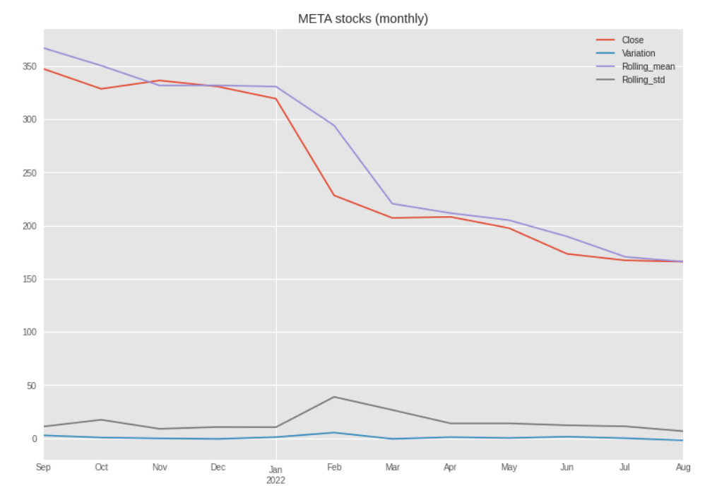
When we smooth out the lines using the monthly aggregated mean values, these spikes disappear and we get a clearer confirmation of the overall downward trend.
What we could do next, is plot some sort of confidence interval, pretty much like we would calculate a set of Bollinger bands. To do so, we simply create the following two new series:
- The
["Upper"]serie adds a moving (or rolling) standard deviation to the close values. - As you might expect, the values stored in the
["Lower"]serie will subtract the same moving standard deviation from the corresponding["Close"]serie.
def getInterval(data):

    dframe = (

        data

        .filter(["Close"])

        .pipe(lambda x: x.assign(

            Rolling_mean = x["Close"].rolling(window=30).mean(),

            Upper = x["Close"] + x["Close"].rolling(window=30).std(),

            Lower = x["Close"] - x["Close"].rolling(window=30).std()

        ))

    )

    return dframe


def getIntervalPlot(data):

    fig = plt.figure(figsize=(15, 9))

    ax = fig.add_subplot(1,1,1)

    x_axis = data.index

    ax.fill_between(x_axis, data["Upper"], data["Lower"], color="grey")

    ax.plot(x_axis, data["Close"], color="red", lw=3, label="Close")

    ax.plot(x_axis, data["Rolling_mean"], color="blue", lw=3, label="Rolling mean")

    ax.set_title('Confidence interval for META stocks')

    plt.legend(loc="upper right")

    plt.xticks(rotation=45)

    plt.show()


df2 = getInterval(df)

getIntervalPlot(df2)
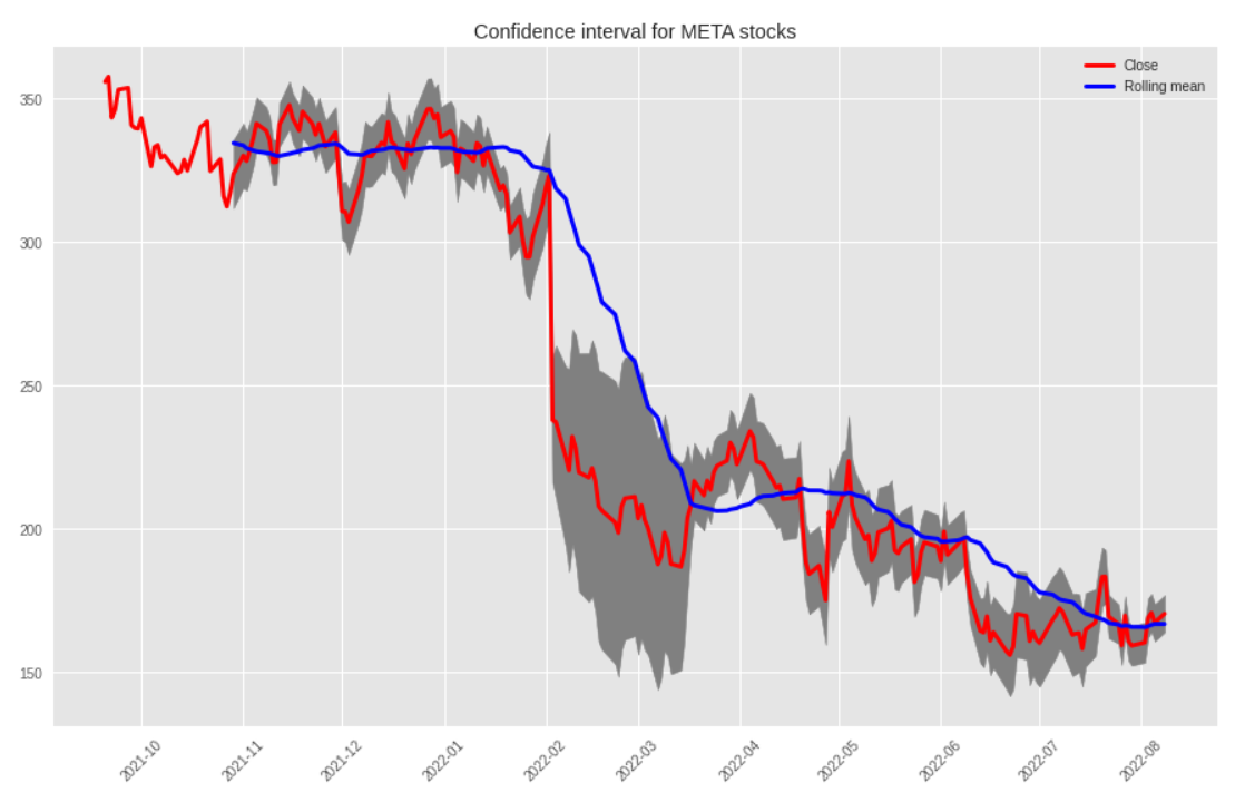
All that’s really new here is that we’re using Matplotlib’s fill_between() method to add a filling color between the upper and lower bounds.
Alright, I’ve been talking about a general downward trend for a little while now, but we should probably use a more scientific approach to assess the validity of that statement. That’s exactly what StatsModels’ .seasonal_decompose() method will do, as well as provide some further insights regarding the seasonality of the dataset.
def getDecompositionPlot(data,freq,title):

    results = seasonal_decompose(

        x=data,

        freq=freq,

        model="additive"

        )


    plt.rc("figure", figsize=(15,11))

    decomposition_results.plot().suptitle(title, fontsize = 18)

    plt.show()


getDecompositionPlot(df["Close"],12,"Mutliplicative decomposition for META stocks")
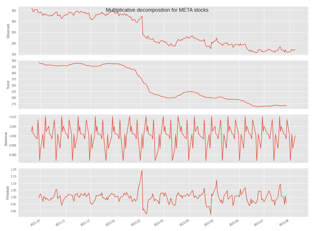
Because we set the ["Date"] serie as the index of the dataframe, we can very simply leverage the freq parameter to pass any frequency resampling value that we decide to as an argument (in this case, 12).
Please note that we are invited to pick a decomposition model. If you don’t know which model to choose from, this great article from Penn State University makes that decision much easier:
- The additive model is useful when the seasonal variation is relatively constant over time.
- The multiplicative model is useful when the seasonal variation increases over time.
We can therefore go for "additive", as the seasonal trend seems reasonably stable over time.
PyCaret and regression
That’s all good, but how do we know what regression model would provide us with the most accurate predictions for our ["Close"] serie? Do we simply try to fit all the models that we know of onto this dataset, and write down their accuracy scores as we go through each result output?
I have some good news: we don’t have to, and this is where PyCaret is going to make our life much easier.
We should probably do some preprocessing work first, like playing around with Pandas’s .diff() method to try and make the mean values stationary, etc.. But as we might cover that in another article, let’s just start by splitting our main dataframe into a training and a testing datasets. We can then pass these into PyCaret’s setup() function, alongside the following other parameters:
target: The values that we want to train the models on.fold_strategy: we simply want Pycaret to understand what type of data we are working with, which in this case implies that the corresponding date for each instance of["Close"]can be found in the index of the dataframe. This will determine what type of cross validation strategy is used.fold: Refers to the number of folds to be used in cross validation. The default value is 3, so we could have done without filling this parameter.session_id: Works pretty much like SciKitLearn’srandom_state. This is a random integer that is passed as a parameter to make sure we can reproduce the exact same results at a later stage if we want to.
train_data = df.head(int(len(df)*(90/100)))

test_data = df.tail(int(len(df)*(10/100)))


s = setup(

    data=train_data,

    test_data =test_data,

    target="Close",

    fold_strategy="timeseries",

    fold = 3,

    session_id = 123

    )
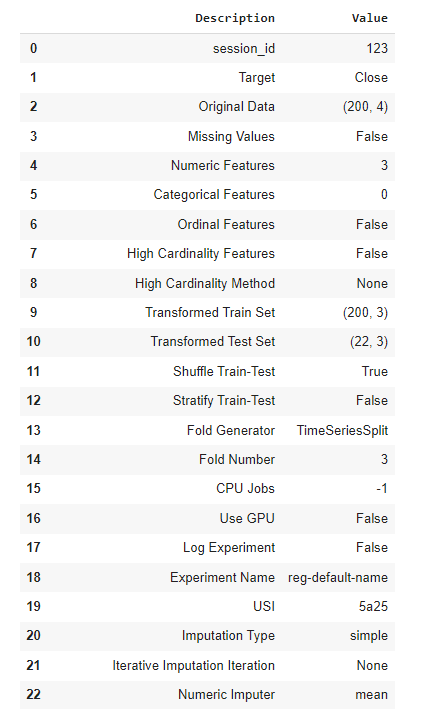
What we get in return is this comprehensive list of additional parameters that we probably won’t pay much attention to today, though it does contains some valuable pieces of information.
The key takeaway for us here, is what PyCaret thinks are the best regression models for this dataset. To obtain this information, we simply call the compare_models() function and choose which evaluation metric we want the models ranked by. In this case, we went for mean absolute error but you can pick any of the metrics that you see in the screenshot below.
best = compare_models(sort="MAE")
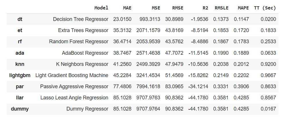
It seems that for this dataset, the Decision Tree Regressor model is providing us with the best possible results, closely followed by the Extra Tree Regressor model.
If the results are too close to one another, we can always ask PyCaret to select the best performing model for us, using the following line of code:
best_model = predict_model(best)

I hope you enjoyed reading this article, see you next time!