Time Series Forecasting With Meta's Prophet
An example of what we’ll be doing in this article
Please note that though I am currently employed by Meta, this article expresses my own views and wasn’t endorsed by my employer
The past few years have seen the rise in popularity of new libraries whose purpose is to focus on ease of use and automation. If like me you have always been fascinated by time series forecasting, you must then be familiar with packages like Dart or PyCaret.
But the most popular of these easy-to-access frameworks is probably Prophet, which was developed by the core data science research team at Meta (formerly known as Facebook).
The purpose of this article is to show what an end-to-end practical implementation of Prophet might look like. We’ll be exploring a real-life dataset, and comparing the performance results of Prophet’s projected values against those of other popular models. My hope is that after reading this article, you’ll have a clear idea of how to get started and build your first prediction engine.
Hey dude, where’s my data?
As obvious as it may sound, we can’t make predictions if we don’t have a dataset! We could simply fit our model to a random csv file from Kaggle, but to make the whole exercise a bit more fun we’re instead going to use a popular library named YFinance. As its name may or may not suggest, it is an open-source tool that uses the Yahoo! Finance public API. This means that we won’t need any API key and that there won’t really be any limit to the amount of queries that we can make over time.
import pandas as pd
import yfinance as yf
Retrieving a year’s worth of Twitter stocks data is as simple as passing a handful of parameters through’s YFinance’s .download() method:
def getDataframe(company,start_day,end_day):
    dataframe = yf.download(
        company,
        start=start_day,
        end=end_day,
        progress=False,
        auto_adjust=True
        ).reset_index()
    dataframe = (
        dataframe
        .set_index(pd.DatetimeIndex(dataframe["Date"].values))
        .drop(columns=["Volume"])
        )
    return dataframe

df = getDataframe("TWTR","2021-12-31","2022-12-31")
df.tail()
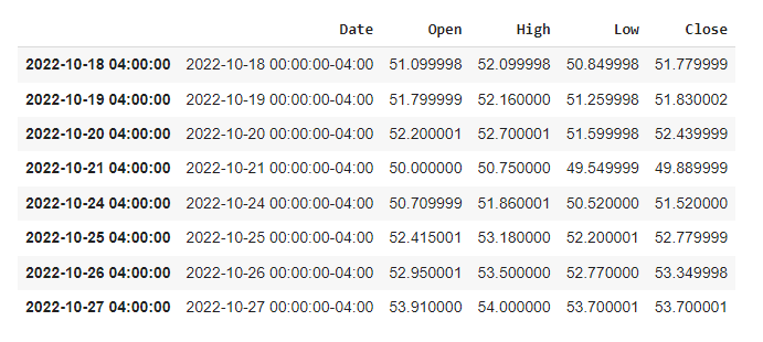
What we just did here is pretty straightforward: we specified which ticker we wanted to get data for, defined a start and end dates, and got rid of a column we had no use for.
What have you done Elon?
Before we start predicting future stock prices, we might want to see if we can learn anything from the historical data that we just retrieved. The reason why I wrote earlier that using Twitter stock market data would potentially be more “fun”, is that 2022 was a pretty intense year for the social media platform. Rumours of Elon Musk wanting to buy the company surfaced as early as in late December 2021, with him making a first offer in April 2022. He then, as we all know, withdrew that offer in July, and eventually bought the company in October before firing half of its staff a week later. Last but not least, Twitter is no longer on the stock market, so at the time that I’m writing this article (Jan 2023) the recorded last stock price value for the company dates back to October 22 2022.
Boy, what a year.
Now we could import any of the popular Python visualisation libraries and plot some of Pandas’s built-in time series specific methods such as .rolling() or .ewm(). But what we’ll be doing instead, is create our charts using a library named mplfinance. If you’re not familiar with this package, you can best describe it as a wrapper around Matplotlib that was specifically designed to work with financial data. Let’s see what happens if we pass our dataframe object as an argument to the .plot() method:
import mplfinance as mpf

mpf.plot(df)
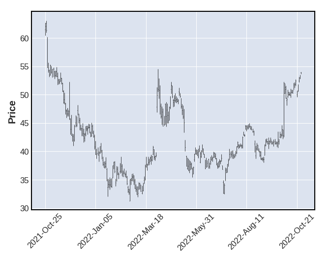
As you can see, mplfinance has set some default parameters for us. The overall look and feel of our simple line chart differs from what Matplotlib offers straight out of the box, with a backgroud colour that to me feels a bit like ggplot2’s. We could make things a bit more interesting by changing the simple line trend to candlesticks, and by visualisating three distinct moving averages calculated over 3, 6, and 9 day intervals:
def getMAVPlot(serie,frequency,title):
    mpf.plot(
        df.drop(columns=[serie]).resample(frequency).mean(),
        title=title,
        figsize=(15,9),
        type="candle",
        mav=(3,6,9)
        )

getMAVPlot("Date","W","Smoothed out Monthly Moving Average for Twitter's stock prices")
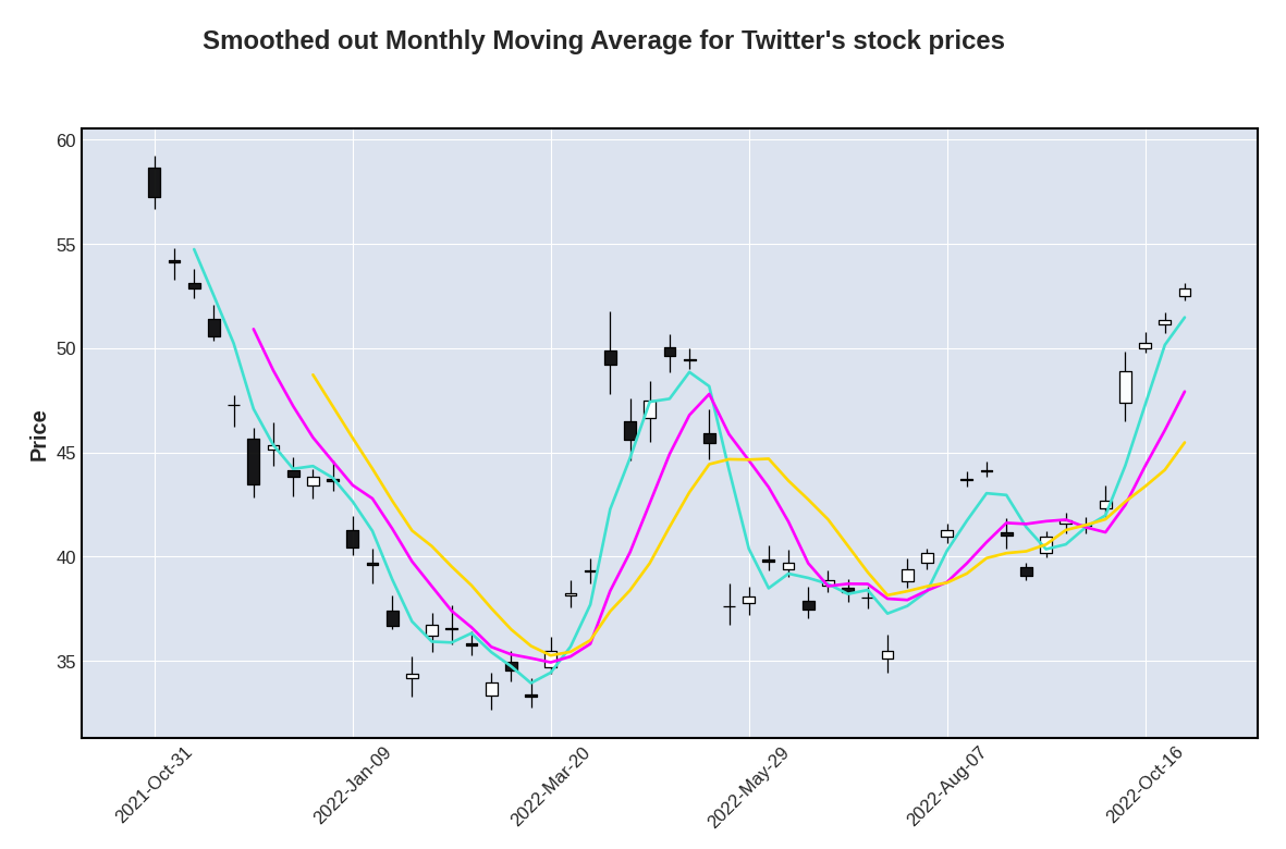
That already looks much better and we can now clearly see some important delta between open and close prices, especially during the second half of the year. We get a better overview of the general trend if we resample the dataframe object to a weekly average, and fill in the delta between the lowest and highest prices:
def getCandlePlot(serie,frequency,title):
    mpf.plot(
        df.drop(columns=[serie]).resample(frequency).mean(),
        title=title,
        figsize=(15,9),
        fill_between=dict(
            y1=df["Low"].resample(frequency).mean().values,
            y2=df["High"].resample(frequency).mean().values,
            alpha=0.2,
            panel=0,
            color="blue"
            )
        )

getCandlePlot("Date","W","Smoothed out daily variation for Twitter's stock prices")
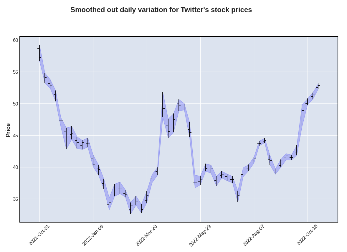
What’s also worth noticing is that each and every time Elon Mush was rumoured to either make or withdraw an offer to purchase Twitter, the stock prices systematically went either above or below a “mean plus or minus one standard deviation” threshold:
upper = df["Close"].mean() + df["Close"].std()
lower = df["Close"].mean() - df["Close"].std()

def getCandlePlotSTD(serie,frequency,title):
    mpf.plot(
        df.drop(columns=[serie]).resample(frequency).mean(),
        title=title,
        figsize=(15,9),
        type="candle",
        hlines=dict(
            hlines=[upper,lower],
            colors=["blue","blue"],
            linestyle="-.",
            alpha=0.3
            )
        )

getCandlePlotSTD("Date","W","Smoothed out lower and upper standard deviation for Twitter's stock prices")
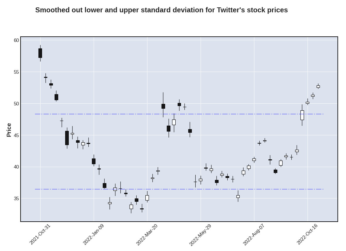
What’s pretty cool is that we can actually very easily visualise these rumours or announcements using vertical lines:
def getEventsPlot(serie,frequency,events,title):
    mpf.plot(
        df.drop(columns=[serie]).resample(frequency).mean(),
        title=title,
        figsize=(15,9),
        type="line",
        vlines=dict(
            vlines=events,
            linewidths=(1,1,1),
            colors=["red","red","red"],
            alpha=0.5
            )
        )

getEventsPlot("Date","W",["2022-04-25","2022-07-08","2022-10-27"],"Impact of Elon Musk's announcements over Twitter's stock prices")
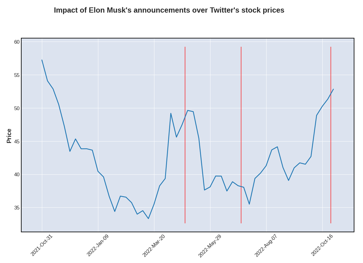
We’ve been talking about a general trend for a little while now, but there might be more than meets the eye and we should probably use a more scientific approach to try and identify potential patterns. Well that’s exactly what StatsModels’ .seasonal_decompose() method does, as well as provide some further insights regarding the seasonality of the dataset:
from statsmodels.tsa.seasonal import seasonal_decompose

def getDecompositionPlot(data,freq,title):
    results = seasonal_decompose(
        x=data,
        period=freq,
        model="additive"
        )

    plt.rc("figure", figsize=(15,13))
    results.plot().suptitle(title, y=1.05, fontsize = 18)
    plt.show()

getDecompositionPlot(df["Close"],12,"Mutliplicative decomposition for Twitter stocks")
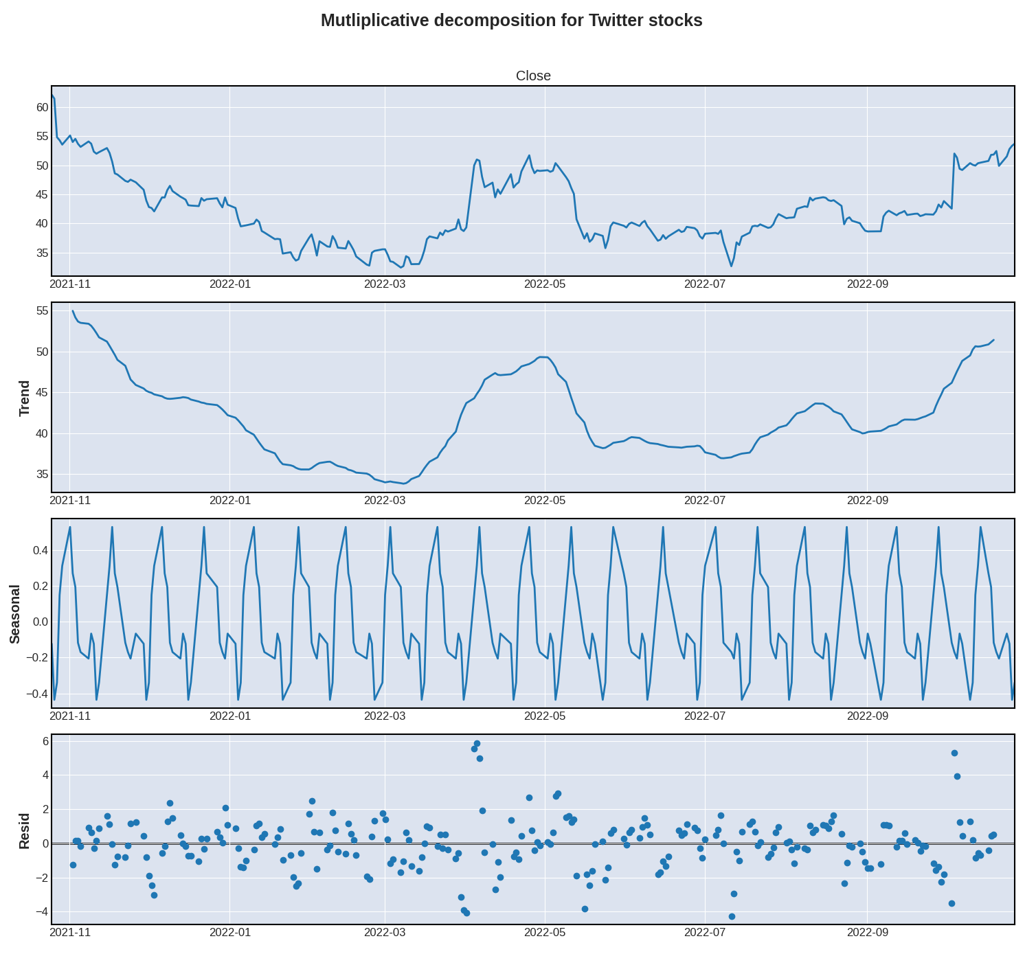
There seems to be a strong element of seasonality, which is often the case with stock prices. Now that we’re pretty familiar with our dataset, let’s explore some of the most basic functionalities of the Prophet library!
Prophet
As discussed in the introduction of this article, Prophet was developed internally at Meta. Here’s how its developers introduce their project on the official website:
“Prophet is a procedure for forecasting time series data based on an additive model where non-linear trends are fit with yearly, weekly, and daily seasonality, plus holiday effects. It works best with time series that have strong seasonal effects and several seasons of historical data. Prophet is robust to missing data and shifts in the trend, and typically handles outliers well.”
If you’re wondering why this type of model is called additive, it’s simply because it adds multiple decomposed parts (seasonality, trend, holidays, etc..) in order to explain some of the underlying trends. And what is great with decomposable models, is that they make it relatively easy to extract various coefficients and understand the impact of each decomposed part.
Please note that of all the modules that we’re going to import, only the main one (prophet.Prophet) is mandatory. We’ll be using the other modules to either visualise or evaluate our predictions.
from prophet import Prophet
from prophet.plot import add_changepoints_to_plot, plot_plotly, plot_components_plotly, plot_cross_validation_metric
from prophet.diagnostics import cross_validation, performance_metrics
The first thing that we need to do, is extract the "Date" and "Close" series from our dataframe object, and rename them. Prophet requires our series to be changed to "ds" and "y" respectively:
def getProphetDF(data,serie1,serie2):
    result = (
        data
        .filter([serie1,serie2)
        .rename(columns={"Date":"ds","Close":"y"})
    )
    return result

df_prophet = getProphetDF(df,"Date","Close")
If you’re familiar with any of the popular machine learning packages, what we’re going to do next should be pretty straightforward. We first need to instantiate a Prophet object, pass any parameter that we might want to into its constructor, and fit the model to our dataset:
m = Prophet()
m.fit(df_prophet)
Hey, wait.. Aren’t we supposed to split our dataset into a train and test subsets??? As in, say we want to train a model on 80% of the historical data, and keep the remaining 20% for testing purposes, shouldn’t we write something like the below code first? The official quick-start guide doesn’t seem to provide more information as to whether or not we should separate our dataset the same way we would with any other model. Let’s just ignore the official recommendations for now and split our time series data the old-school way:
eighty = round((len(df_prophet) / 100) * 80)
train = df_prophet[:eighty]
test = df_prophet[eighty:]
Anyway, though the base model would probably deliver sone great results, we might actually want to pass some optional parameters to our Prophet object:
m = Prophet(
    weekly_seasonality=True,
    interval_width=0.95,
    #n_changepoints=5
)
m.add_country_holidays(country_name="US")
m.fit(train)
Let’s review what we just did:
weekly_seasonality: remember earlier on when we used StatsModels to decompose our"Close"values? We definitely want to set the default weekly seasonality toTrue(Please note that we can changeweekly_todaily_/monthly_/yearly_, depending on the dataset)interval_width: this is possibly the most important parameter that we might want to play around with today. Long story short, the interval width represents the assumption that the future values will see as many trend changes as the historical ones. Given the fact that Elon Musk just ran a poll on Twitter asking whether he should step down as CEO of the company or not, I think we can confidently assume that there should be more trend changes over the next few weeks.n_changepoints: though I decided to comment out this parameter, I thought we would want to discuss it, and therefore left it in the code. If you go back to our moving averages plots earlier on, you might spot some abrupt trend changes. Each time Elon Musk either made an announcement or was rumoured to make one, the general trend would go crazy. Well, though Prophet is perfectly able to spot those changes on its own, we can specify the number of changes manually if we so choose to.add_country_holidays(): now, don’t quote me on this, but as far as I’m aware, the stock price data that we’re getting is US based. And I think that most stock exchange markets close during bank holidays
Prophet supports a bunch of other settings, and I strongly invite you to read the official documentation if you want to know more.
The main takeaway here, is that we’re likely to have a certain vlume of missing values within our dataset:
- Stock prices typically aren’t recorded during weekends
- The US stock market closes on bank holidays
Luckily for us, Prophet provides some built-in techniques for dealing with missing values:
“Prophet has no problem with missing data. If you set their values to NA in the history but leave the dates in future, then Prophet will give you a prediction for their values.”
Big thanks to my friend Shota for flagging this!
We’re now going to generate predictions for a total of 180 days. Why 180 days? Because that’s the length of our test subset!
future = m.make_future_dataframe(periods=180, freq="D")
forecast = m.predict(future)
forecast.tail(10)
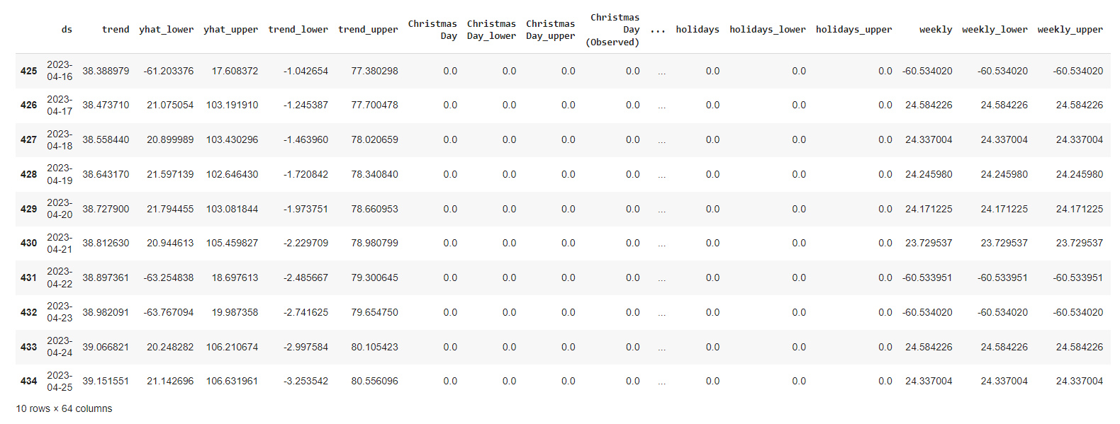
It seems that we now have a bunch of new and fancy components to explore!
yhat: our final predictions (basically, the trend + additive term values)"yhat_lower"/"yhat_upper": the confidence intervals for the"yhat"values"trend"/"trend_lower"/"trend_upper": the predicted growth for our global trend"additive_terms"/"additive_terms_lower"/"additive_terms_upper": these are the values for the total seasonality effect
That’s arguably a lot of information to process. The good news is, Prophet offers some built-in plots that we can easily customize:
from matplotlib import pyplot as plt

def getPredictionPlot(title):
    fig = m.plot(forecast, uncertainty=True)
    plt.title(title)
    plt.xlabel("Date")
    plt.ylabel("Price in $")
    plt.legend(loc="upper left")

getPredictionPlot("Predictions for Twitter's stock values")
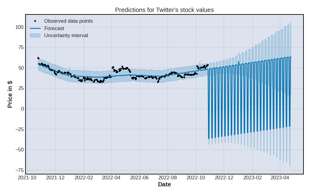
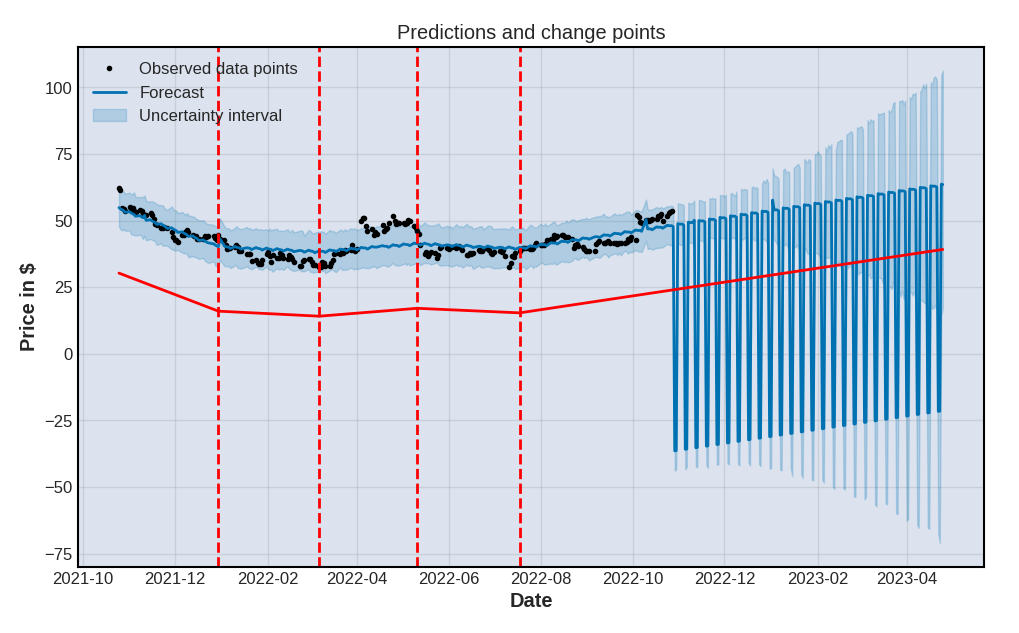
As you can see, Prophet’s .plot() method is also built upon Matplotlib, and our charts have inherited the look and feel of our earlier mplfinance! If you want to know more about this, feel free to read how setting global RcParams works. We can also visualise the n_changepoints values that we left as default earlier on when we fitted the model to our dataset:
def getChangePlot(title):
    fig = m.plot(forecast)
    a = add_changepoints_to_plot(fig.gca(), m, forecast)
    plt.title(title)
    plt.xlabel("Date")
    plt.ylabel("Price in $")
    plt.legend(loc="upper left")

getChangePlot("Predictions and change points")

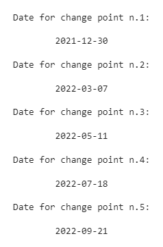
It seems that Prophet has automatically spotted x statistically significant trend changes within our dataset. Had we manually set the number of change points to say, 5, we would of course have seen 5 vertical lines. Which we could then very easily obtained by looping through the .changepoints() method:
def viewChangePoints():
    x = 1
    for cp in m.changepoints:
        print(f"Date for change point n.{x}:\n\n\t{str(cp).split(' ')[0]}\n")
        x+=1

viewChangePoints()
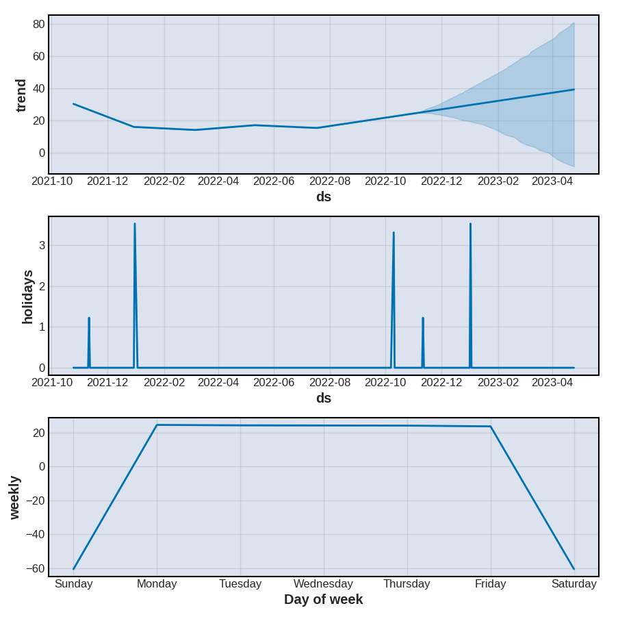
A bit like we did earlier on with StatsModels, we can decompose our time series data into several components, which are going to provide us with some insights on potential underlying trends. You’ll notice that we were probably right when we chose to specify that our data might be affected by US holidays:
def getComponentsPlot():
    fig = m.plot_components(forecast)

getComponentsPlot()
Our next step is to see how well Prophet performed. What we would normally do at this point, is import a third-party evaluation module for time series, such as ‘from sklearn.model_selection import cross_validate’ or ‘from statsmodels.tools.eval_measures import rmse’. But we won’t. Instead, we’re going to rely on Prophet’s built-in evaluation toolkit!
from prophet.diagnostics import cross_validation
from prophet.diagnostics import performance_metrics
from prophet.plot import plot_cross_validation_metric
Before we do this, we might want to discuss a thing or two. As you probably know, time series forecasting is a bit of a unique field, in the sense that the date range for the train data systematically precedes that of the test data. As we can’t really split our train and test subsets randomly, we instead use time-based cross validation, which can be described as some sort of “sliding window” approach.
This is what Prophet’s .cross_validation() method will do for us: fitting the model through sequences (also known as “cutoff points”), taken at successive and equally spaced points in time.
Practically, we want our code to look like this:
df_cv = cross_validation(
    m,
    initial="120 days",
    period="60 days",
    horizon = "90 days"
    )
Where:
initial: is when we want the training period to starthorizon: is the test period of each sequenceperiod: is the gap between the cutoff dates
This creates a new dataframe object, that contains a new serie named ["cutoff"]:
(
df_cv
.tail()
.style
.background_gradient(cmap="Blues_r")
)

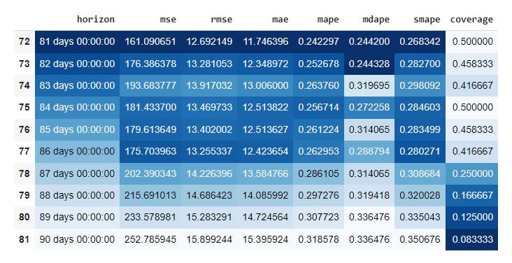
When we pass this df_cv dataframe object through Prophet’s .performance_metrics() method, we get a bunch of metrics across various rolling windows. Each metric is calculated within each rolling window and then averaged across the rest of the rolling windows. The model automatically set those windows for us, processing multiple combinations and sorting them on the go.
def getPerformanceMetrics(howmany):
    result = (
        performance_metrics(df_cv)
        .tail(howmany)
        .style
        .background_gradient(cmap="Blues_r")
    )
    return result

df_p = getPerformanceMetrics(10)
df_p
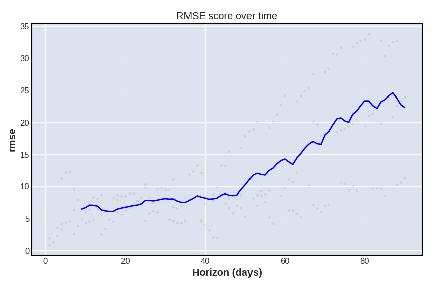
We can then simply plot the result, for whichever metric we choose to observe (here, rmse). This will help us visualise how far in the future errors for our predictions will start increasing:
def getPerformancePlot(metric):
    fig = plot_cross_validation_metric(df_cv, metric=metric)
    plt.title("RMSE score over time")

getPerformancePlot("rmse")
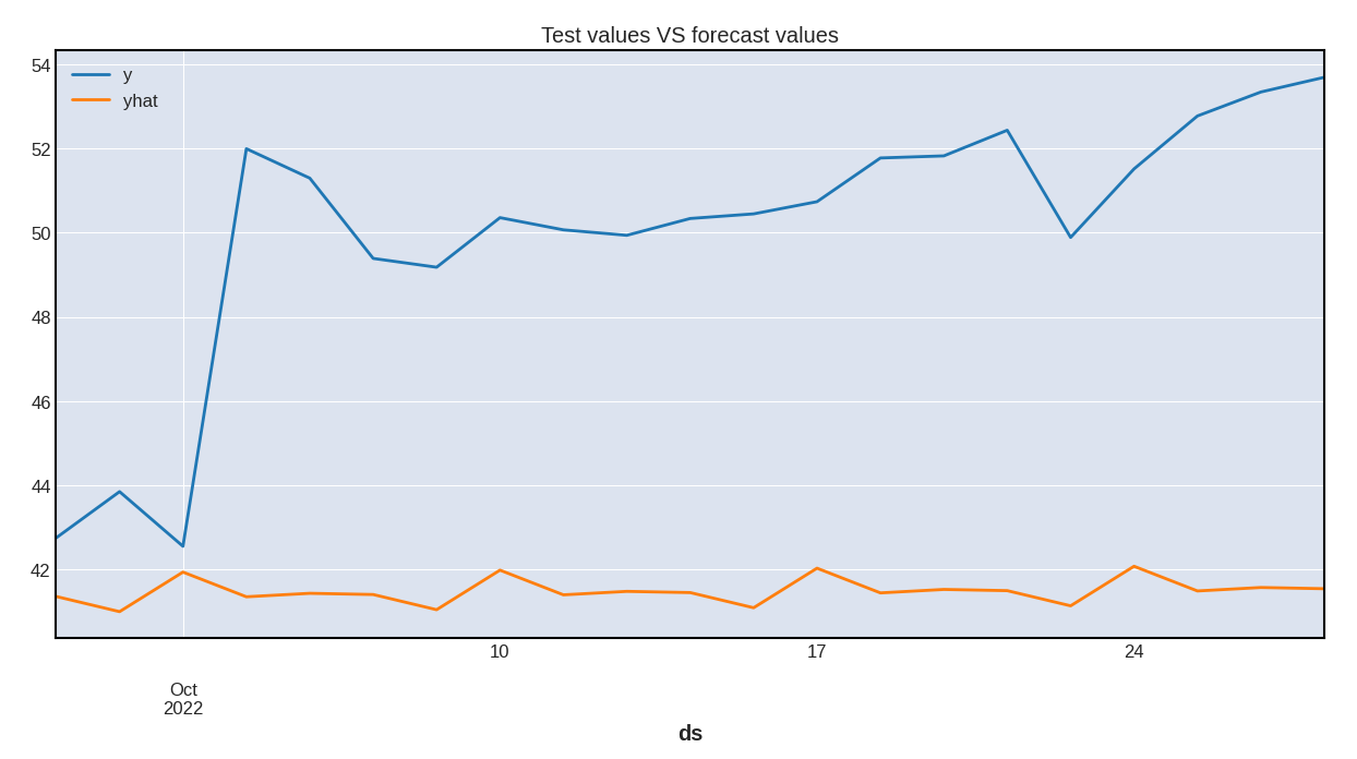
Of course, we should finally plot the predicted yhat values against our test subset. This is however entirely optional:
def getPerformanceComparison():
    f = forecast[["ds","yhat"]]
    (
        test
        .merge(
            right=f,
            how="left",
            left_on="ds",
            right_on="ds"
            )
        .plot(
            figsize=(15,7),
            kind="line",
            x="ds",
            title="Test values VS forecast values"
            )
    );

getPerformanceComparison()
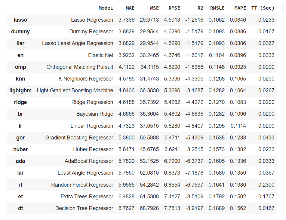
Comparing the results against some popular models
I wrote in July 2022 an article about PyCaret, a Python library that focuses on simplifying the use of multiple models. We won’t be going into too much details as to how to utilise , as you can easily read my article if you want to know more.
What we’re going to do here is quite simple: using the exact same dataset, the exact same train and test split, and the same evaluation metric, we want to evaluate how some of the most popular time series models will perform.
Again, I won’t be describing what each of the following functions does, and you can refer to the official documentation for more information.
from markupsafe import escape
from markupsafe import Markup
import numpy as np
from markupsafe import soft_unicode
from pycaret.regression import *
For PyCaret to process our dataframe object, we need to set the ["Date"] serie as the index of our dataset:
df_pycaret = (
    df
    .set_index(pd.DatetimeIndex(df["Date"].values))
    .filter(["Date","Close"])
    .rename(columns={"Date":"ds","Close":"y"})
)
As you can expect, the train and test splitting process is the exact same as before:
eighty = round((len(df_pycaret) / 100) * 80)
train = df_pycaret[:eighty]
test = df_pycaret[eighty:]
We can then fit our assortment of time series regressors to this new train and test subset:
s = setup(
    data=train,
    test_data=test,
    target="y",
    fold_strategy="timeseries",
    fold = 3,
    session_id = 123
    )
And eventually stack rank the performance of each model by the evaluation metric of our choice. There’s one caveat though:
Most, if not all, of these models might not perform well with missing values. If you remember what we discussed earlier, most stocks data will most likely only contain 5 days of close prices over a week long period. We should then consider the following scores with a pinch of salt, as we didn’t set any paramater as to how PyCaret would handle these missing values.
best = compare_models(sort="RMSE")
best
